Dinara Gataullina is multidisciplinary designer specializing in Web & Product Design. She blends visual storytelling with strategic thinking to create impactful digital experiences
Dinara Gataullina is multidisciplinary designer specializing in Web & Product Design. She blends visual storytelling with strategic thinking to create impactful digital experiences
Dinara Gataullina is multidisciplinary designer specializing in Web & Product Design. She blends visual storytelling with strategic thinking to create impactful digital experiences
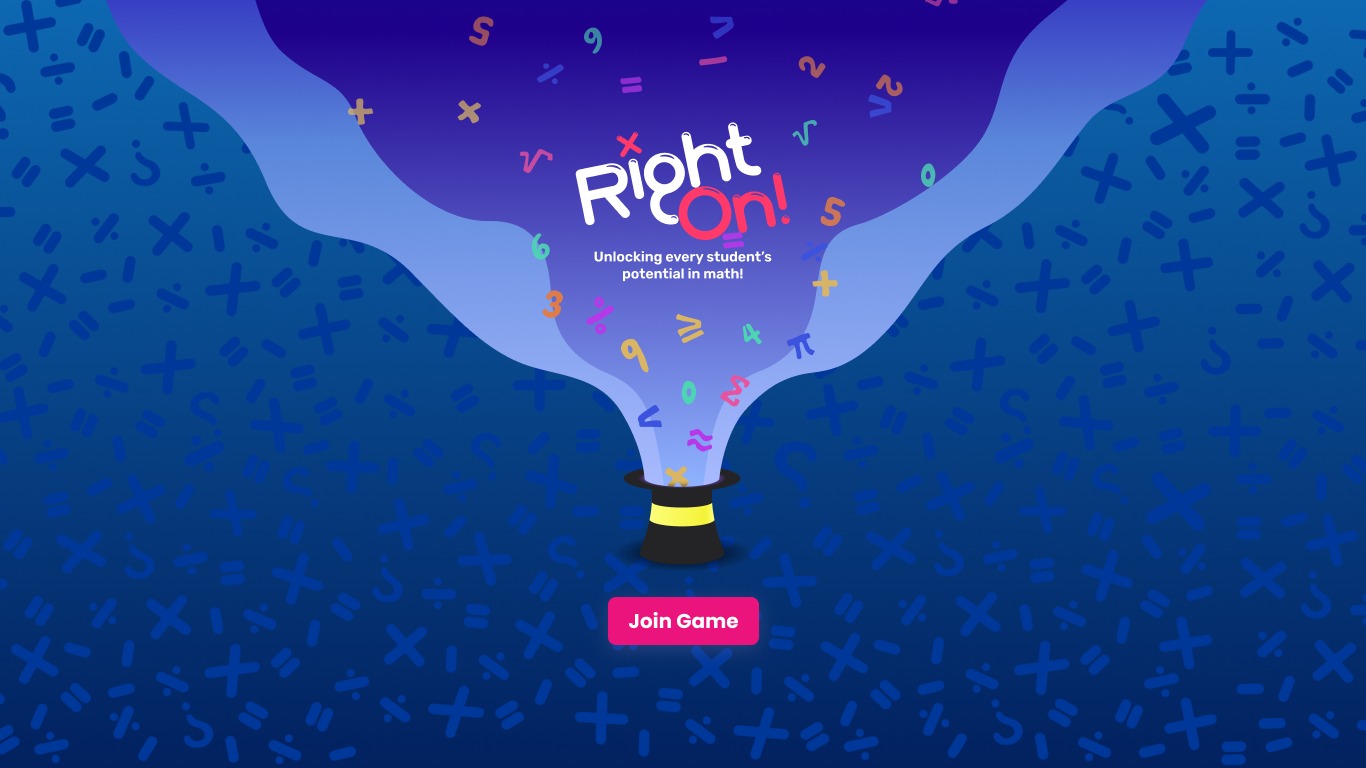
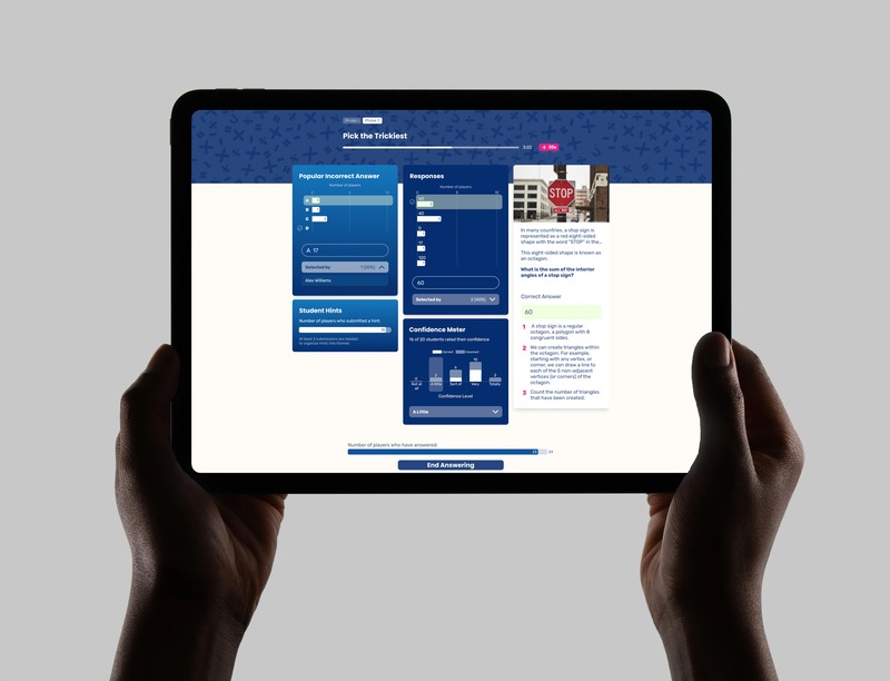
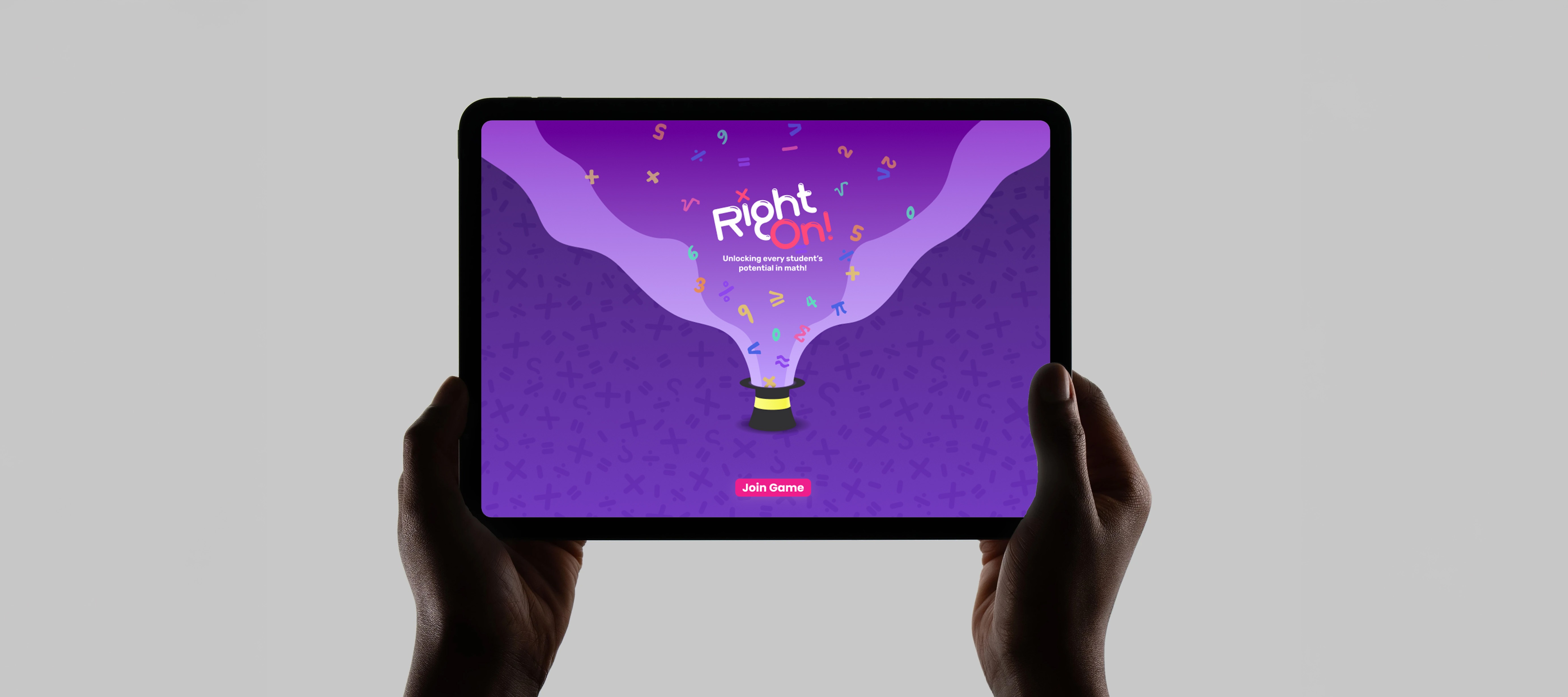
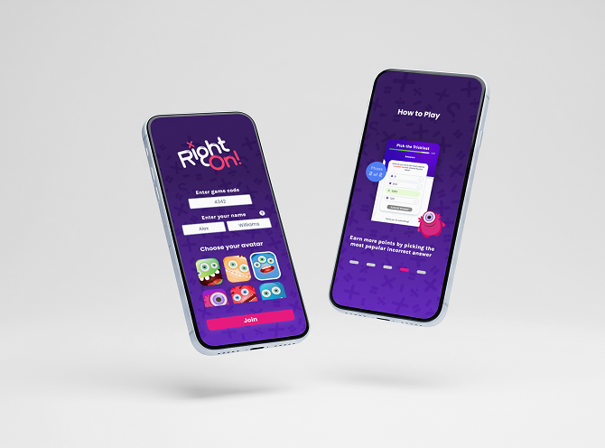
RightOn is an EdTech platform where students participate in interactive math games through Play, while teachers guide the classroom experience through Host. I redesigned the teacher-facing Host flow, which allows teachers to launch questions, manage game phases, review student responses, and lead discussion in real time. The product helps teachers identify common student misconceptions faster through live in-class activities, while encouraging students to think more deeply about why certain answers may be incorrect. As part of the game, students are prompted to predict the most common misconception answer and can earn bonus points for guessing correctly. The goal was to make the Host experience clearer, more consistent, and easier to navigate during a live lesson, helping teachers focus less on managing the interface and more on understanding how their class is thinking.
Help teachers understand what stage of the game they are in, what is happening with students, and what action they need to take next. Make it easier for teachers to review student responses, confidence levels, and common misconception answers during live classroom activities. Use the Host experience to help teachers guide conversations around why students chose certain answers and how the class is thinking overall.
The existing flow did not always make it obvious what phase the teacher was in or when they should move to the next step. Student responses, answer choices, confidence data, and discussion prompts needed stronger visual hierarchy so teachers could quickly understand the most important information. Teachers needed a faster way to spot patterns in student thinking and use those insights to lead meaningful discussion during the lesson.
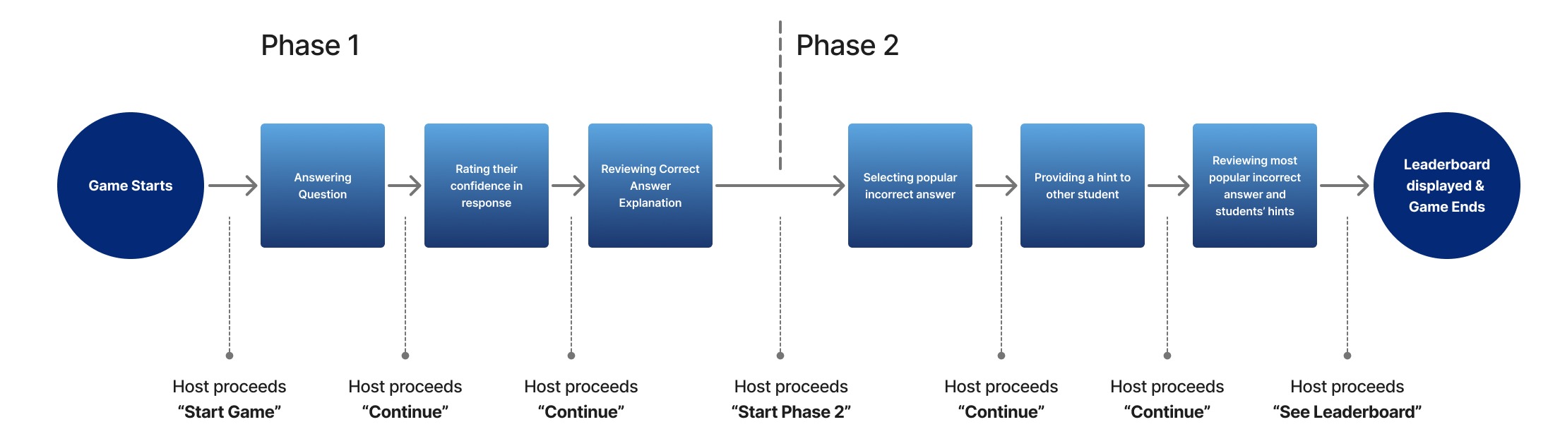
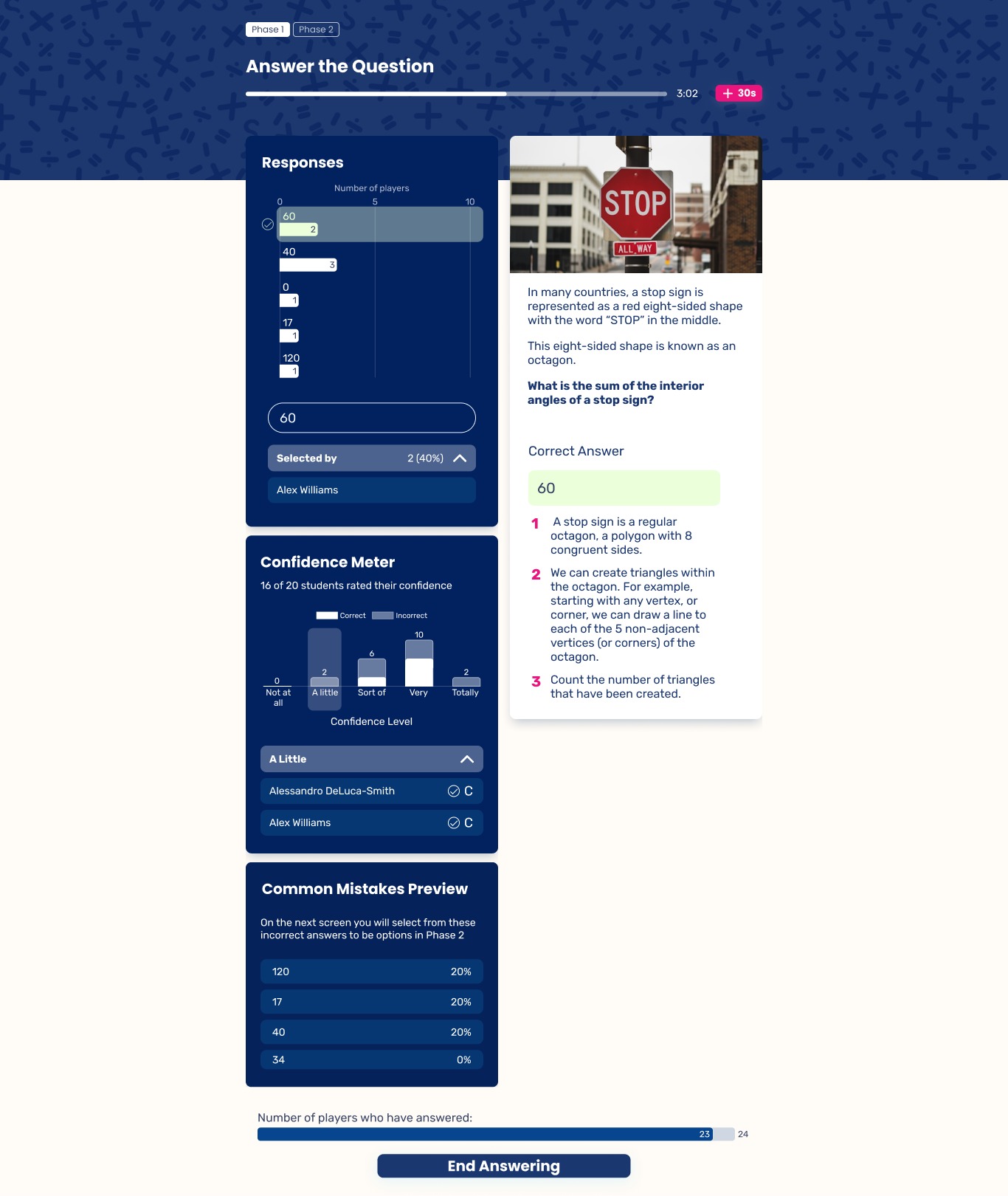
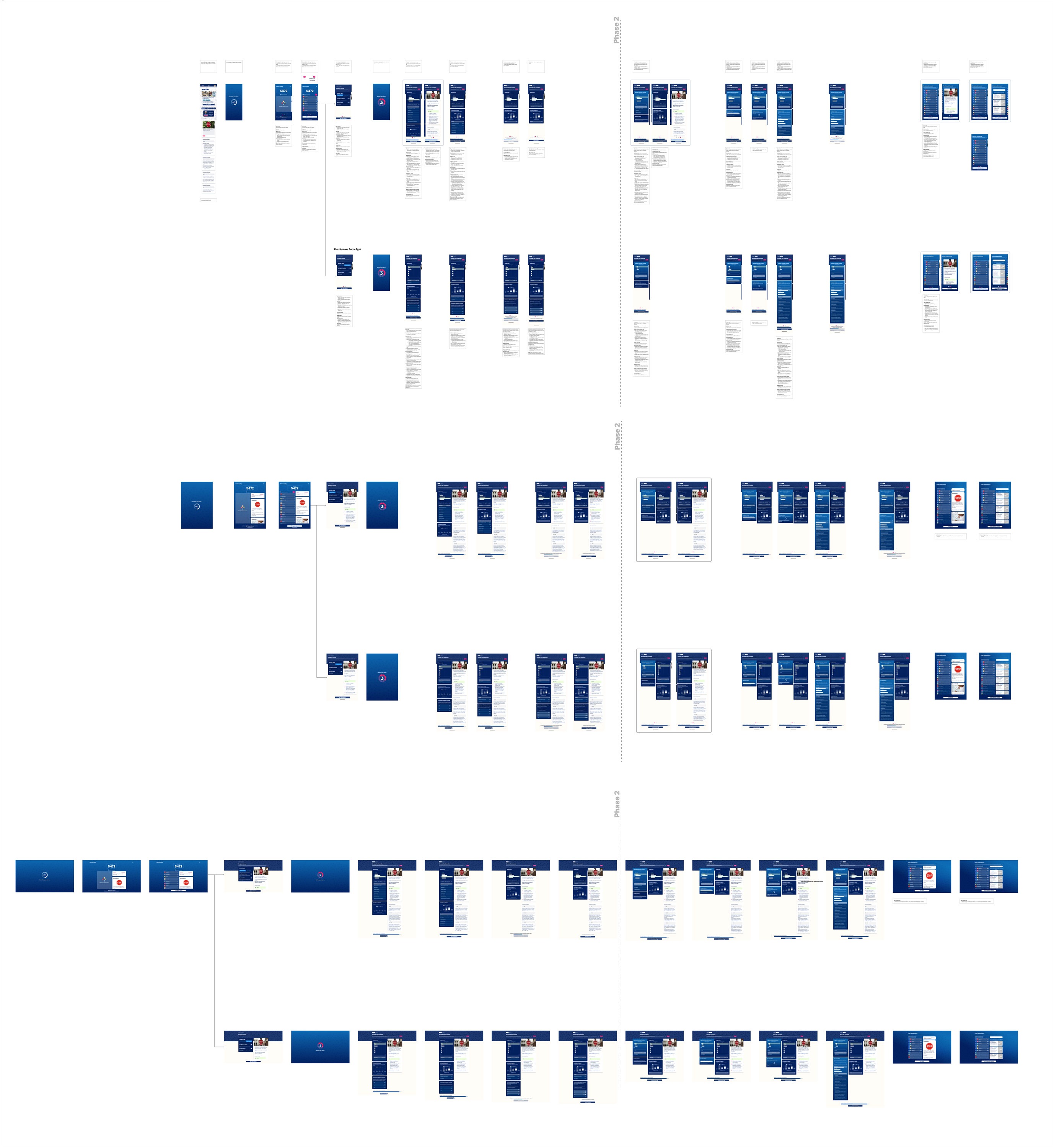
RightOn goes beyond simply finding the correct answer by helping students engage with both correct and incorrect responses. The game is divided into two phases. Phase 1: Students answer the question, rate their confidence, and review the correct answer with an explanation. Phase 2: Students predict the most popular incorrect answer, provide a hint for another student, and then review the common misconception with student hints before the final leaderboard appears.
Student Hints is a new RightOn Host feature I worked on that makes peer learning and student thinking more visible to teachers. During a game, students can submit hints to help their classmates think through a question, while teachers can review all submitted hints from the Host side. This gives teachers a clearer view into how students explain concepts, what strategies they use, and where misconceptions may still be forming. The feature supports learning by encouraging students to articulate their reasoning, learn from peer language, and engage more deeply with the "why" behind an answer.
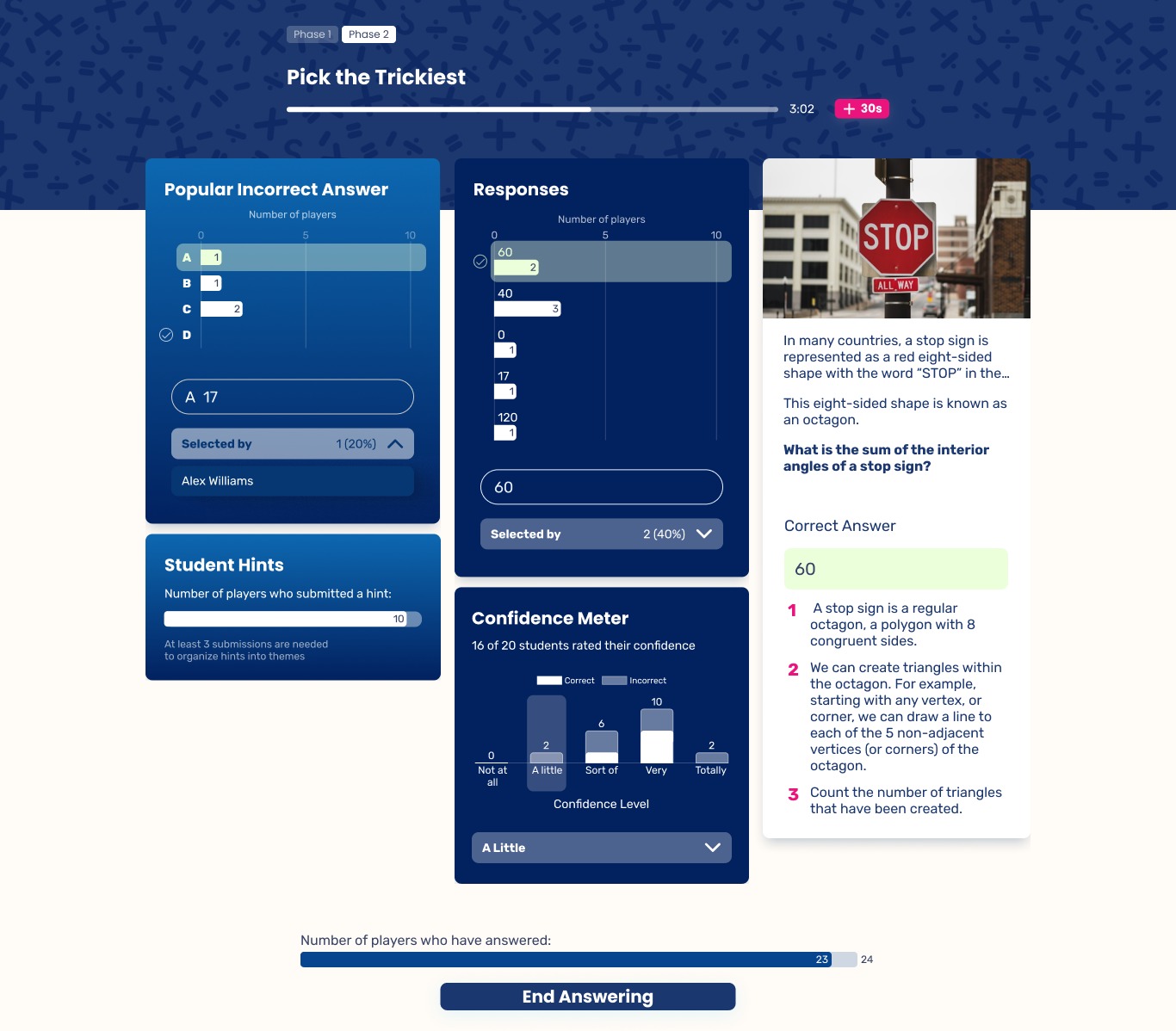
Confidence Meter is a RightOn feature I designed to capture how students feel about their answers, not just whether they are right or wrong. During the first phase of the game, students indicate their confidence level after choosing a response, adding an important layer of context to their performance. In math learning, this matters because confidence is closely connected to self-efficacy: a student's belief in their ability to solve problems and make sense of mathematical ideas. For teachers, confidence data can reveal patterns that answer accuracy alone may miss, such as students who guessed correctly, students who understand the concept but lack confidence, or students who are highly confident in a misconception. By surfacing this information, the feature helps teachers respond more thoughtfully, support student reflection, and create opportunities to build both mathematical understanding and confidence over time.
This project highlighted the challenge of redesigning a live classroom experience where the teacher and student flows need to work together clearly. The Host flow needed to give teachers enough control and insight without overwhelming them during an active lesson. One key learning was that clarity in phase progression, response data, and next actions is essential when teachers are guiding students in real time.
Dinara Gataullina is multidisciplinary designer specializing in Web & Product Design. She blends visual storytelling with strategic thinking to create impactful digital experiences
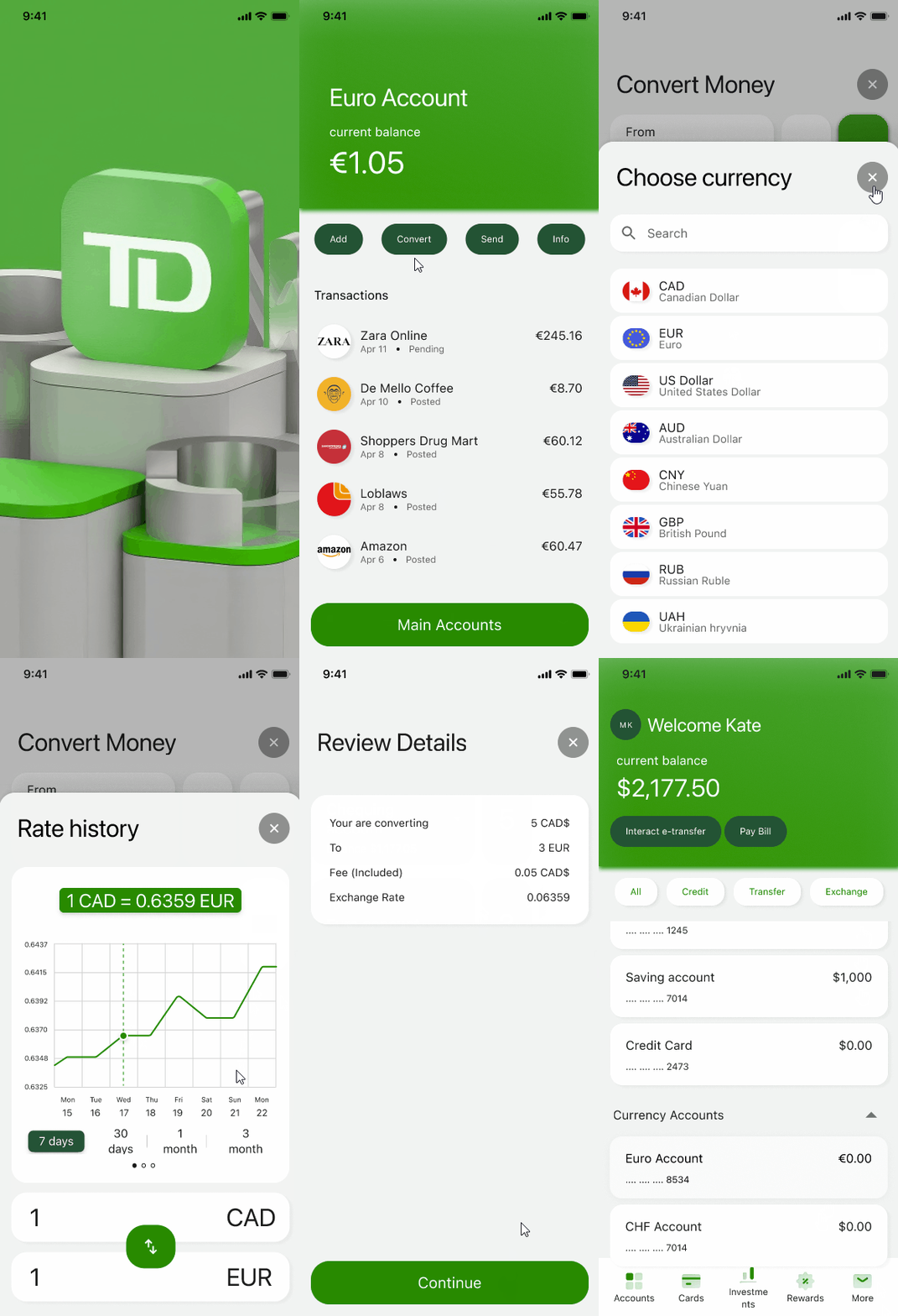
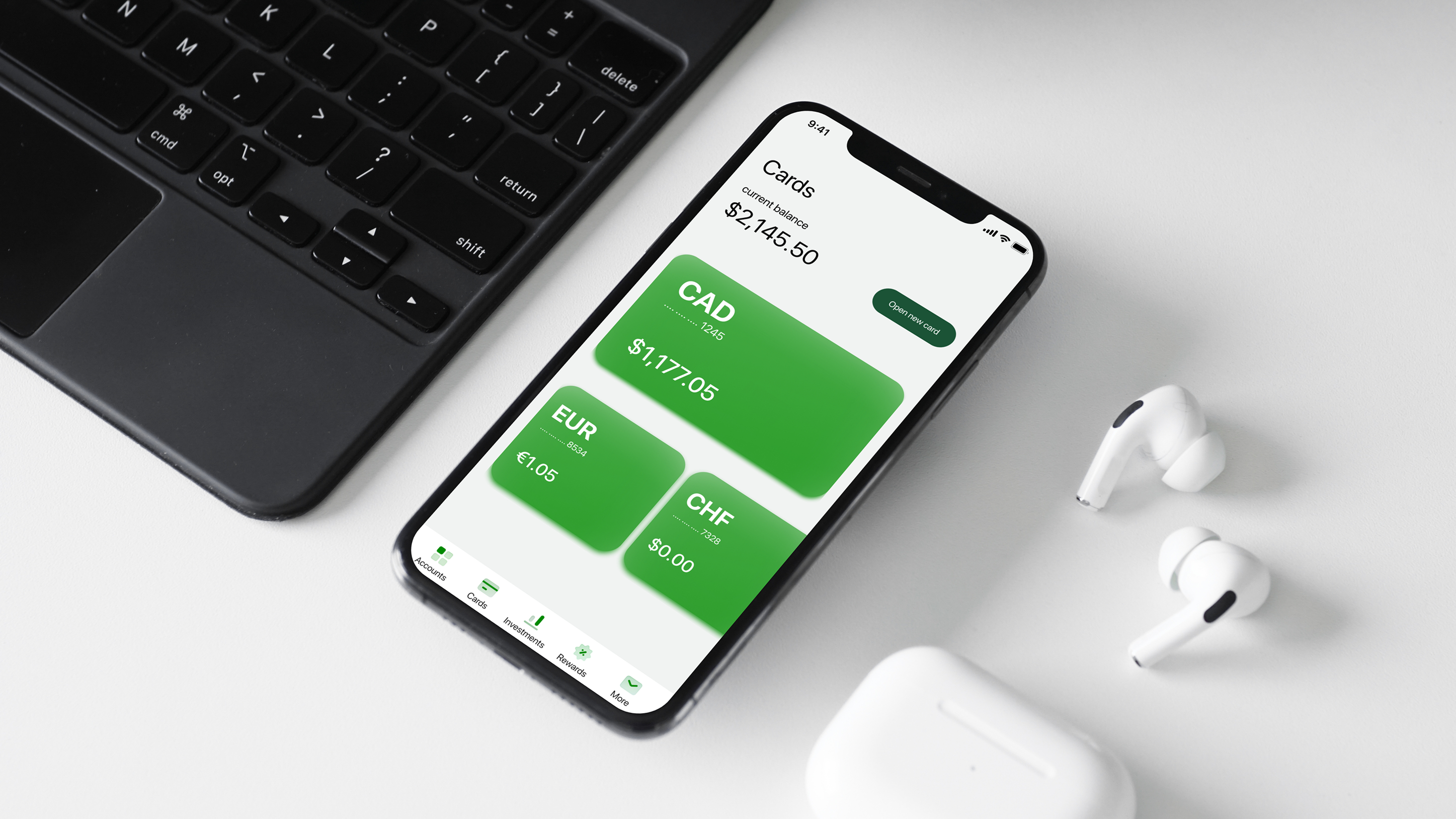
As part of an educational UX/UI project, I redesigned the currency exchange experience in the TD banking app. The goal was to modernize the interface, improve usability, and support increased revenue from currency conversions. By addressing key pain points such as an unclear entry point, confusing navigation, and non-transparent exchange terms, the redesigned flow became more intuitive and scalable. Usability testing showed task success improve from 33% to 67%, with more users able to independently complete currency exchange flows.
Quickly perform currency-related actions without leaving the section, and receive accurate, up-to-date exchange rate information. Increase in revenue from currency conversions. Reduction in support inquiries.
Unclear entry point to the currency exchange section. Confusing navigation due to complex screen architecture. Outdated exchange rate list.
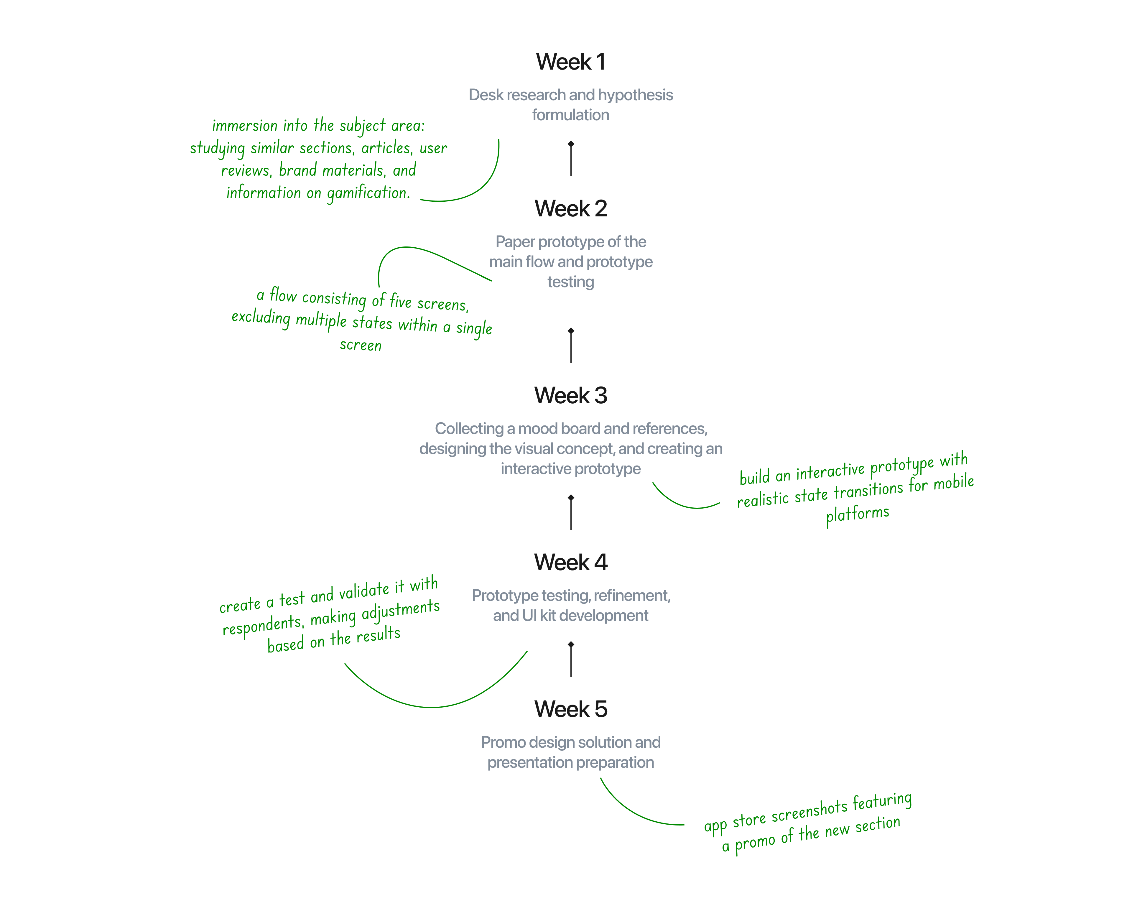
I interviewed users to identify usability gaps, observed how they navigated the app, and gathered insights on features that could better support their tasks. Based on these findings, I designed a clear, human-centered user flow with improved entry points and delivered a concise visual solution that modernized the experience while preserving TD’s brand.
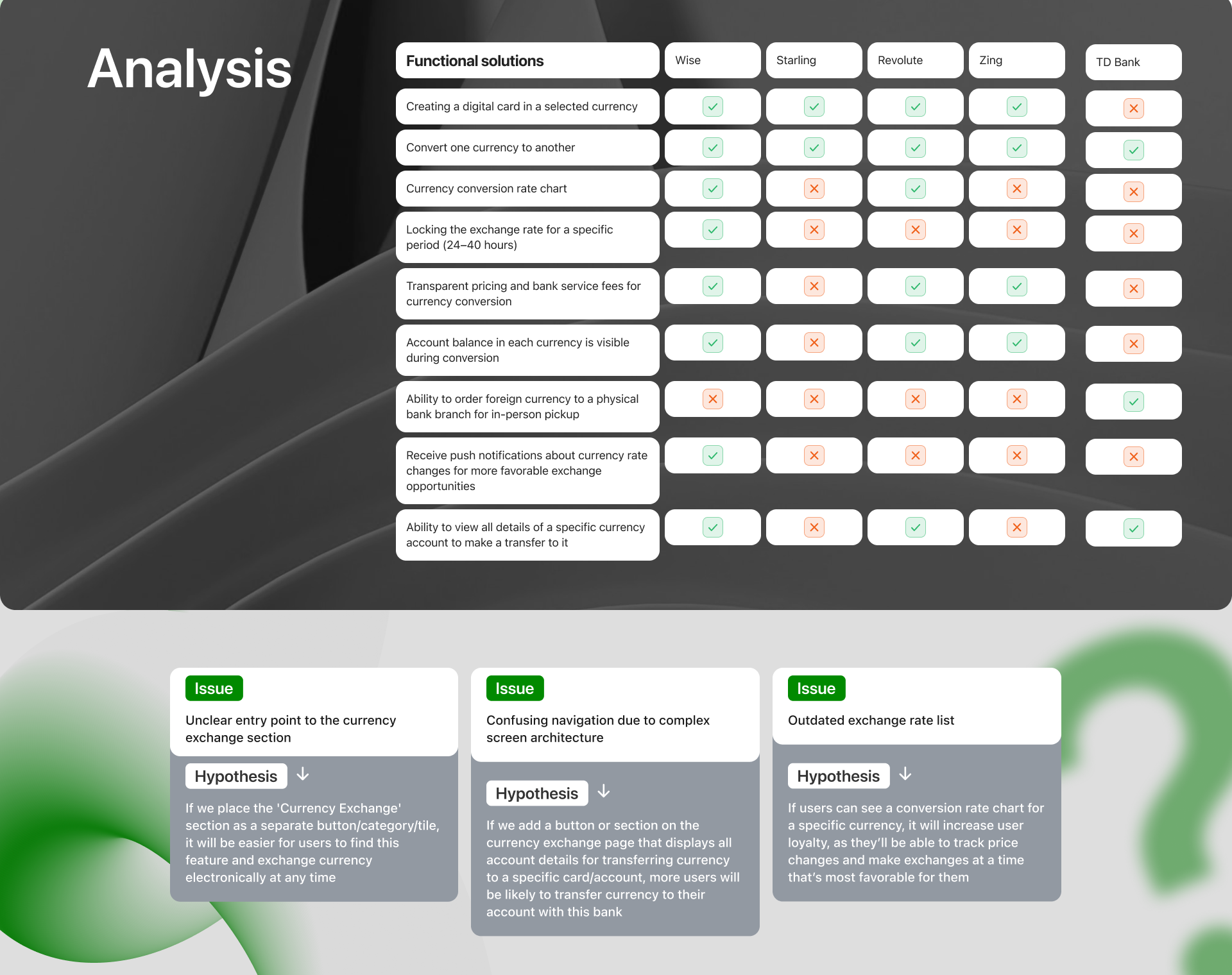
At the start of the project, I analyzed leading currency exchange apps including Wise, Starling, Revolut, and Zing to understand industry standards, functional gaps, and best practices. I compared key features such as currency conversion, rate transparency, notifications, and account management to identify patterns and opportunities. This competitive analysis, combined with early user interviews and observation of in-app navigation, helped highlight usability gaps in the existing TD experience and informed the direction of the redesigned flow.
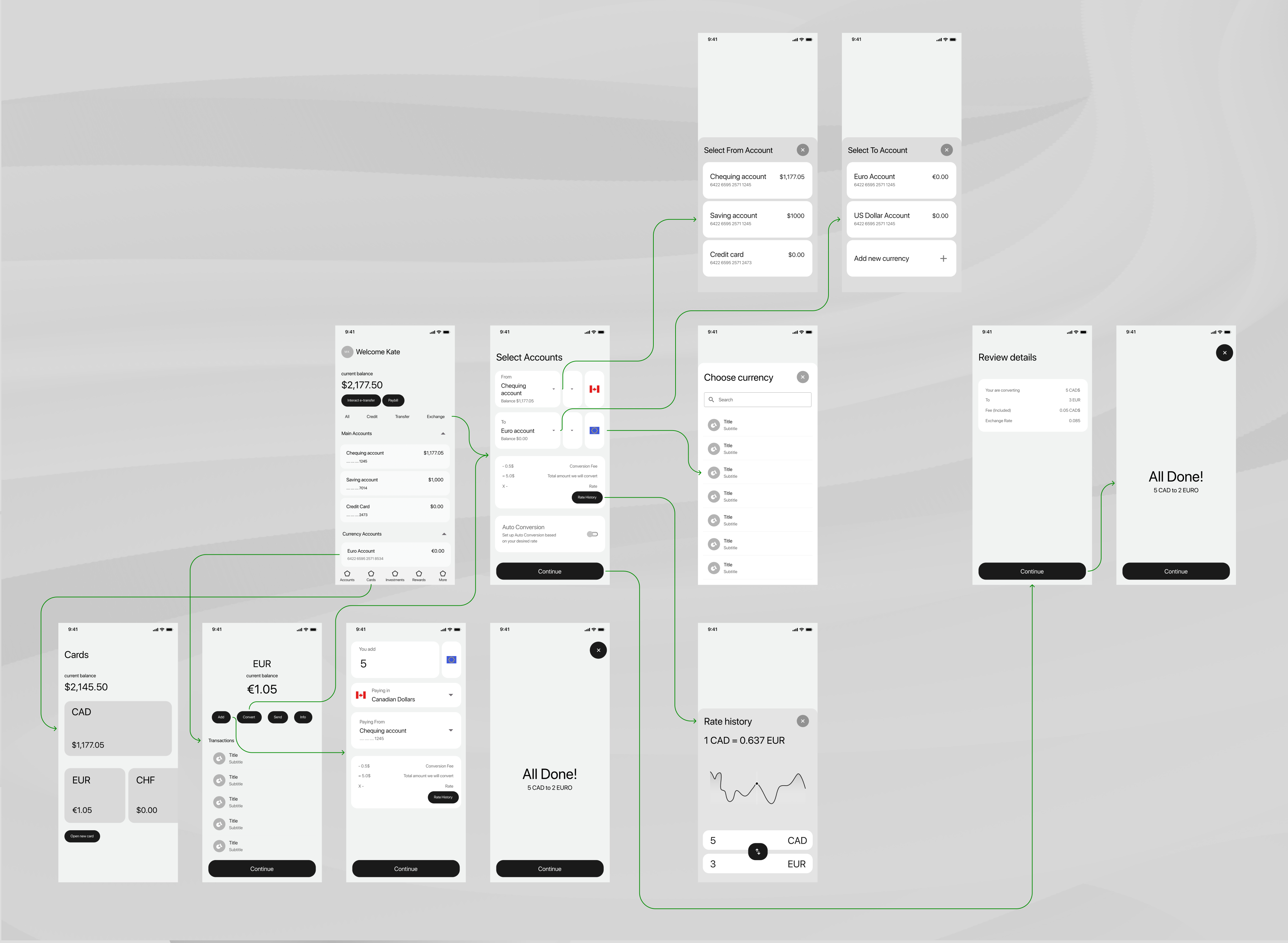
Building on insights from user interviews and observation, I translated early sketches into low-fidelity wireframes that mapped the primary currency exchange flow from app entry to task completion.
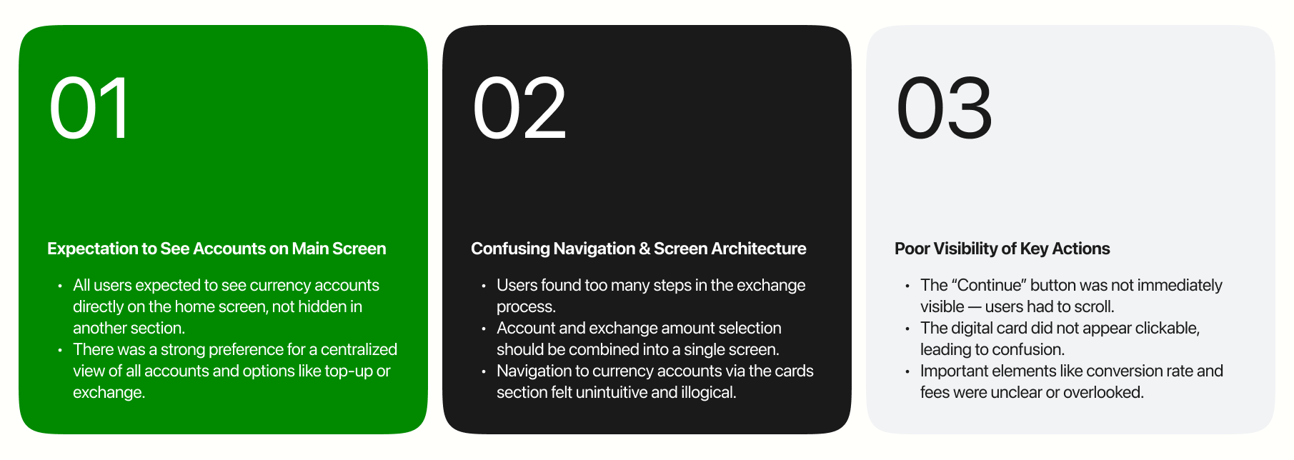
User interviews revealed strong expectations to access currency accounts directly from the main screen, with a preference for a centralized view of accounts and exchange actions. Participants struggled with the existing navigation, citing too many steps and an unclear screen structure during the exchange process. Key actions and information such as buttons, exchange rates, and fees were often overlooked due to poor visibility, leading to confusion and friction.
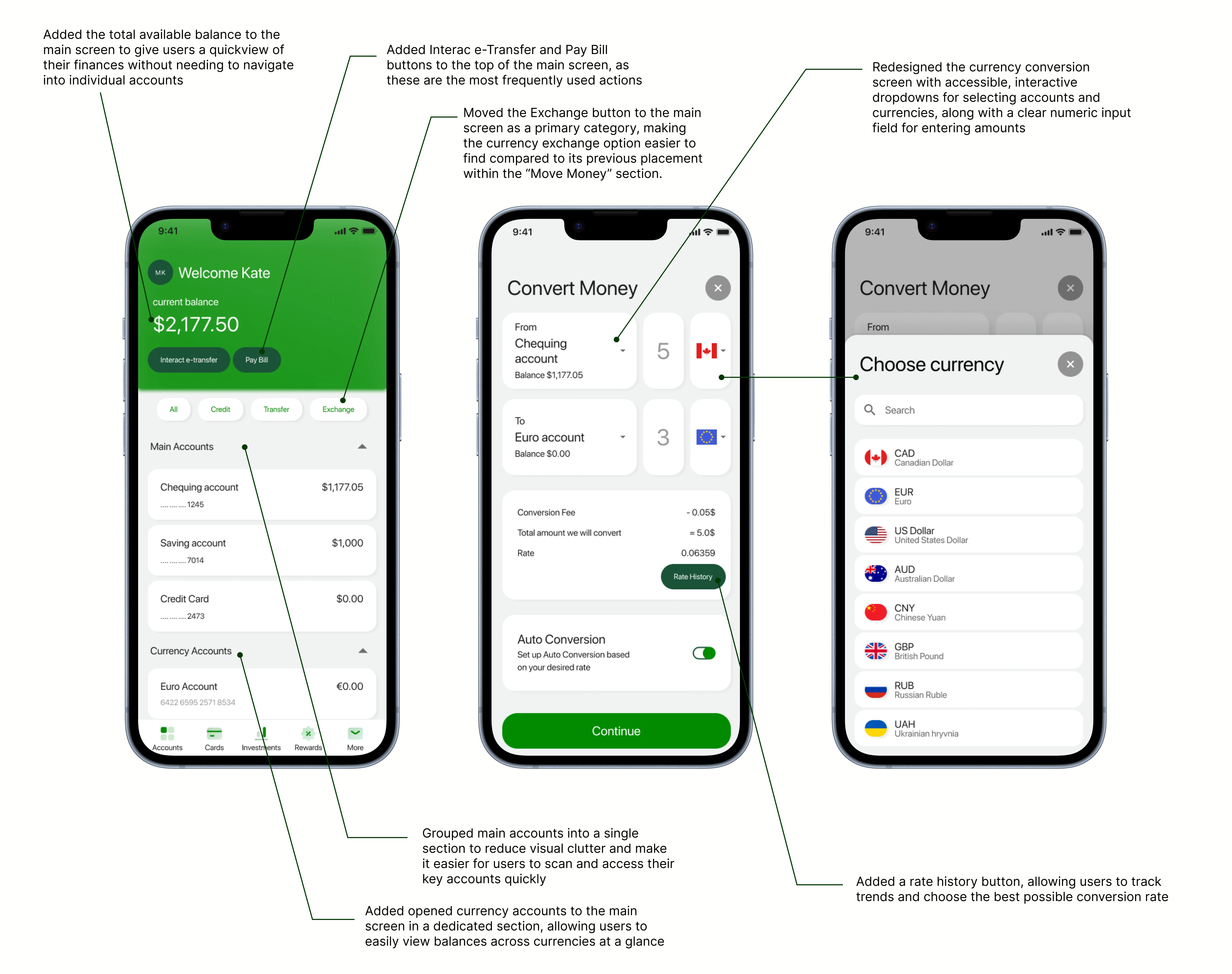
After validating early concepts through wireframes and testing, I refined the currency exchange experience in high fidelity, addressing key usability issues by bringing the Exchange action to the main screen as a primary category.
Key Features: At-a-glance financial overview with total balance, grouped main accounts, and visible currency account balances. Prominent main-screen actions for Exchange, Interac e-Transfer, and Pay Bill to improve discoverability. Simplified currency conversion flow with interactive account and currency selection, clear amount input, and transparent rates and fees. Rate history access to help users monitor trends and choose optimal conversion timing.
This project highlighted the challenges of redesigning a single feature within a large, established banking product. Without access to a public UI library, maintaining TD’s strong brand identity while introducing subtle modernization required careful balance. Most importantly, the work revealed that improving the currency exchange experience required rethinking the user flow from the main screen, not just the feature itself.
Explore A/B usability testing: Test multiple UI variations for key interactions to understand what resonates most with users.
Collaborate with stakeholders and developers: Align information architecture changes with technical constraints and business goals.
Refine visual design using internal systems: Polish UI updates using TD’s design system while preserving established brand patterns.
Measure and iterate post-launch: Track conversion rates, task completion time, and support inquiries to guide further improvements.
Dinara Gataullina is multidisciplinary designer specializing in Web & Product Design. She blends visual storytelling with strategic thinking to create impactful digital experiences
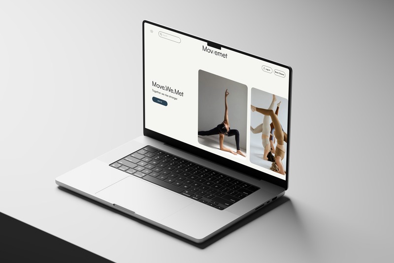
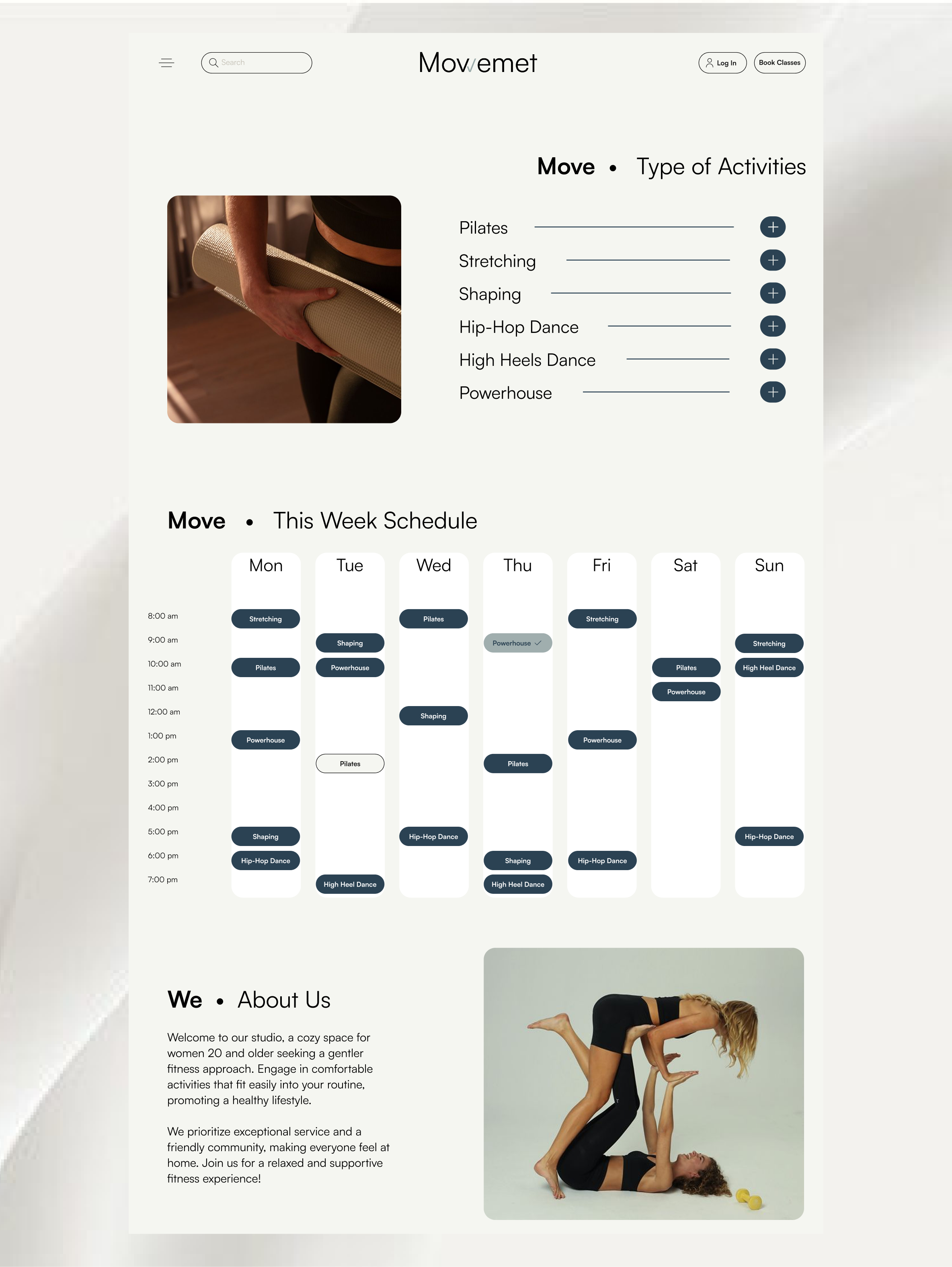
Mowemet is a website concept for a women's fitness studio centered around movement and community. The name combines move, we, and met — reflecting energy, togetherness, and connection. The goal was to design a creative, standout website that breaks away from typical fitness industry designs, using a unique concept and engaging presentation to reflect the studio's personality and welcoming atmosphere.
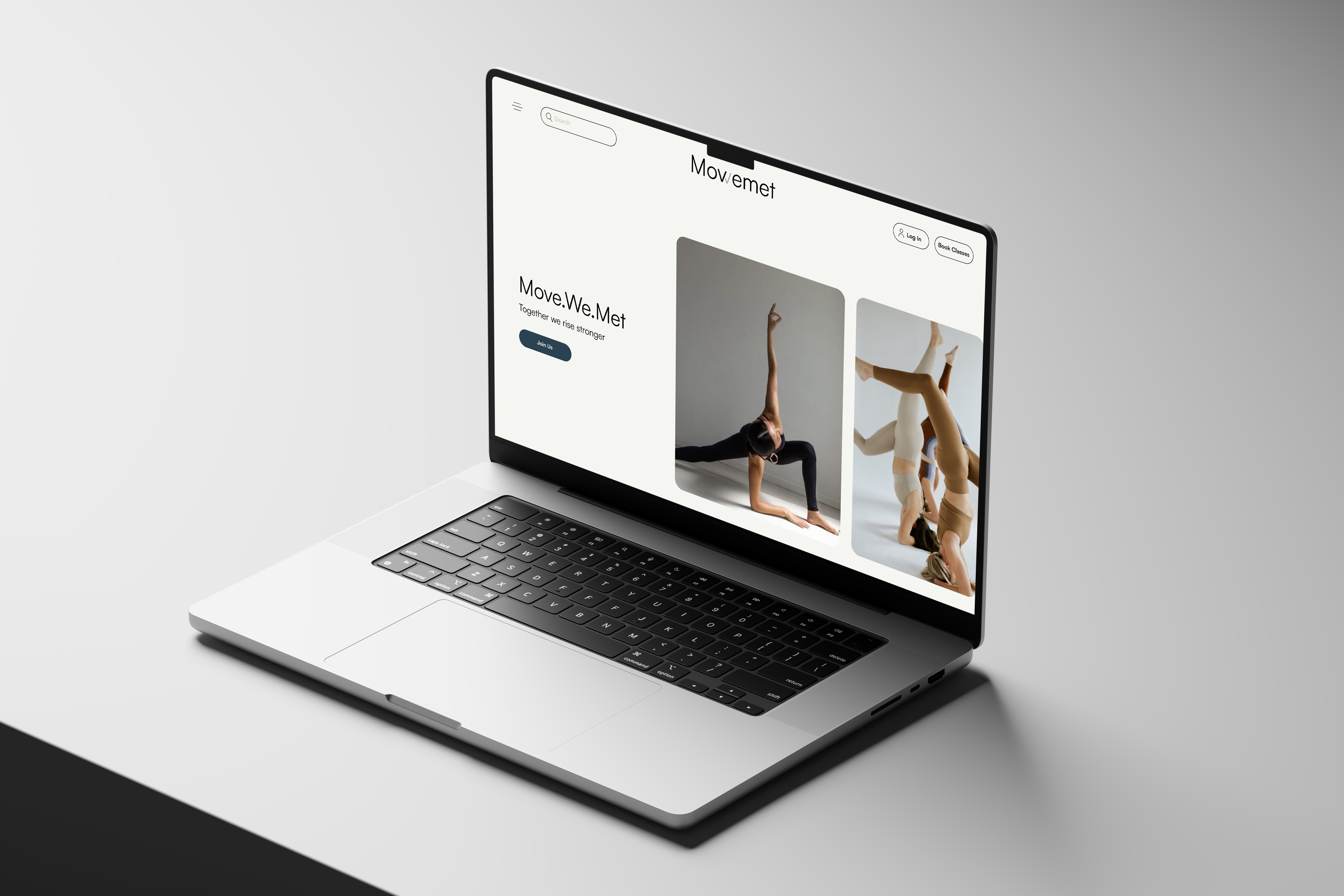
The primary goal of the website is to serve as a strong brand and image platform, conveying the studio's identity, values, and the welcoming, safe atmosphere it offers. It should communicate who the studio is for and how it can be beneficial to potential visitors. Key content priorities include an introduction to the studio, a clear list of available classes categorized by sport type, easy access to the class schedule and sign-up information, and direct links to the studio's social media channels.
Design Objective: Develop a creative, standout website that breaks away from typical fitness industry designs, using a unique concept and engaging presentation to reflect the studio's personality.
Value Proposition: As a small studio, we stand out through our style, personal approach, and service — not scale. The website should convey this distinctiveness and inviting atmosphere.
Women aged 20 and above who prefer low-impact, comfortable forms of physical activity over intense sports. They seek ways to maintain a healthy lifestyle through gentle movement integrated into their routine. This audience values high-quality service, comfort, a cozy and intimate setting, and a friendly, supportive community.
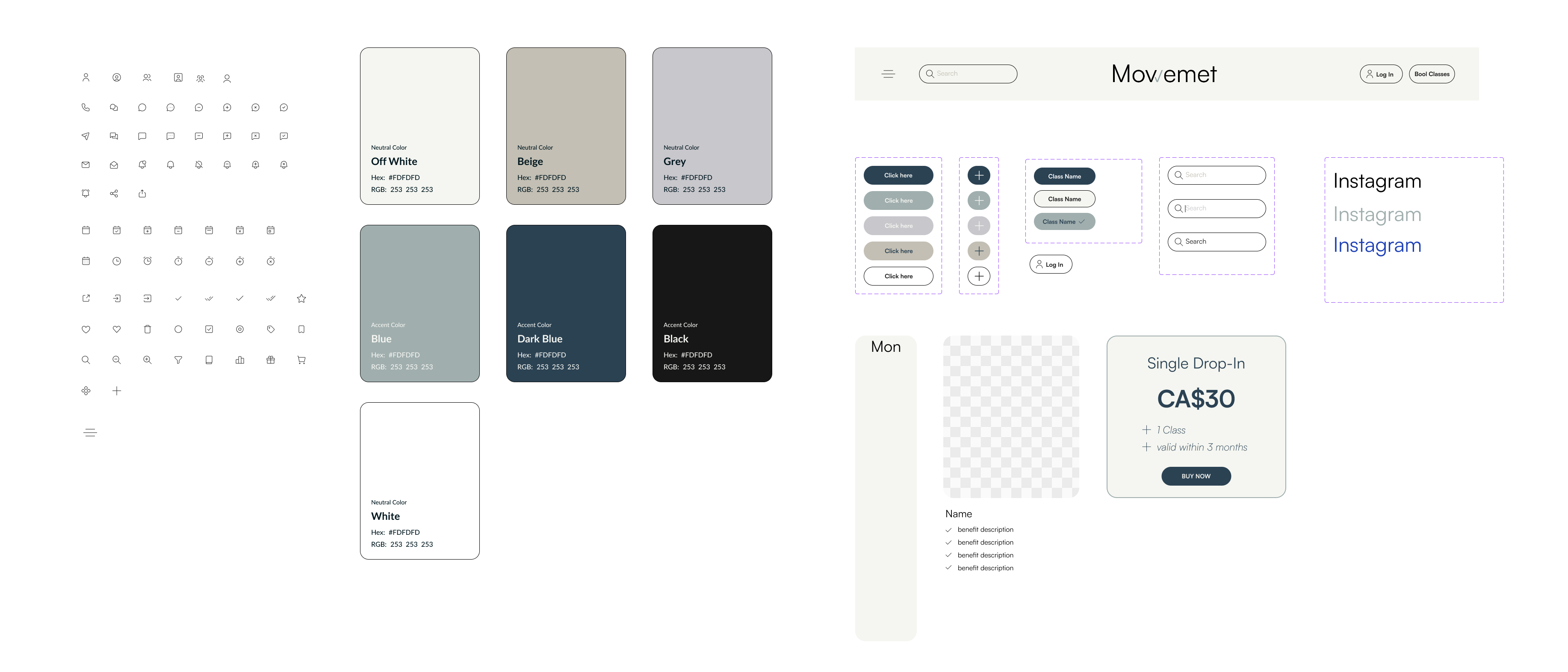
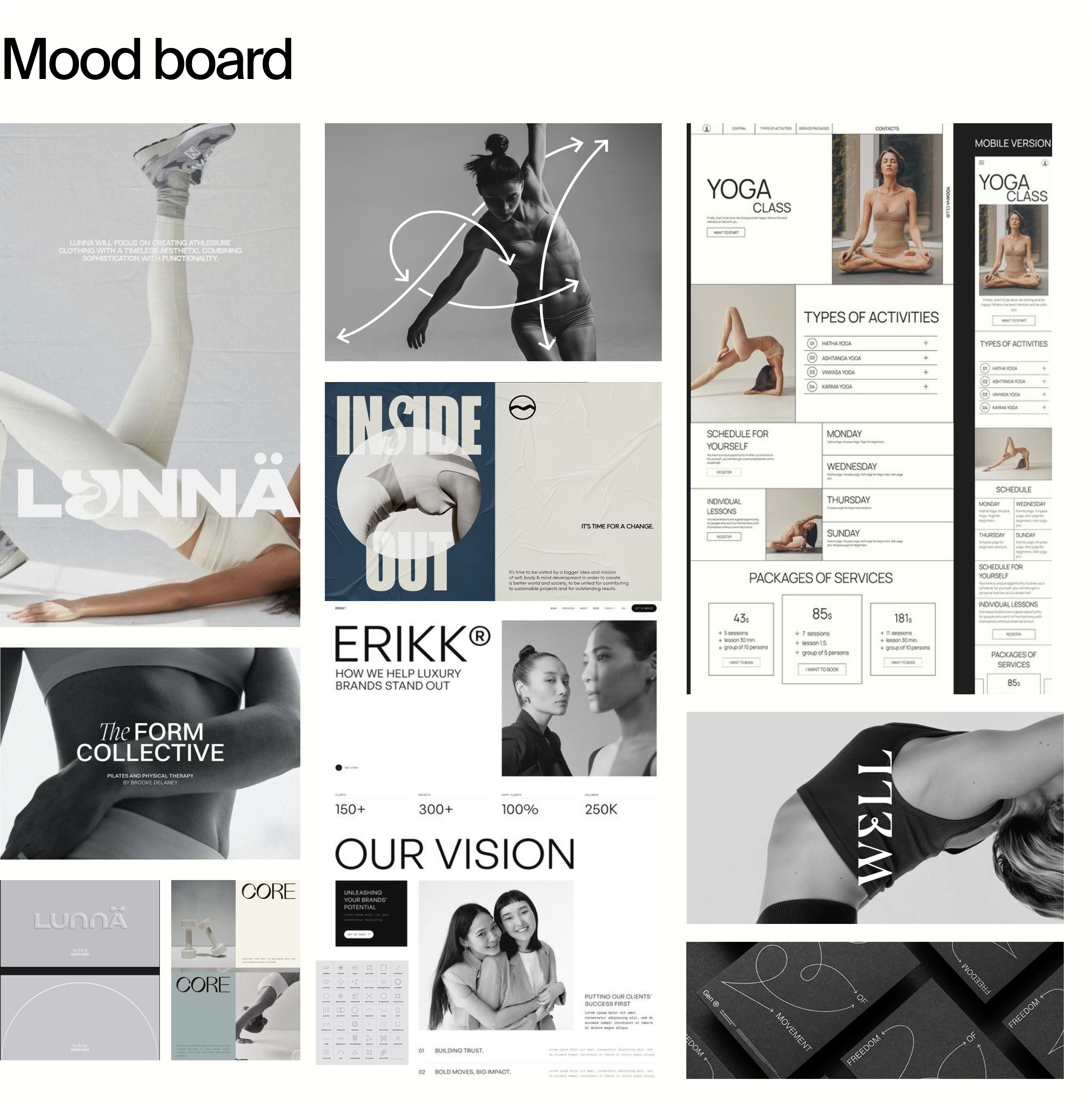
This website concept for a women's fitness studio centers around the themes of movement and community. Inspired by the word mowemet — combining move, we, and met — the design reflects energy, togetherness, and connection. Dynamic visuals and clean, minimalist layouts highlight the importance of physical activity, comfort, and high-quality service. Soft shapes, light tones, and fresh blue accents create an inviting, modern atmosphere that encourages a healthy and active lifestyle.
Dinara Gataullina is multidisciplinary designer specializing in Web & Product Design. She blends visual storytelling with strategic thinking to create impactful digital experiences
To Waste Less, an eco-conscious e-commerce platform aimed at encouraging more sustainable shopping habits. The goal was to redesign the website to create a clean, trust-driven experience that helps users easily discover and purchase plastic-free and environmentally friendly products. By addressing key pain points such as low visual clarity, lack of trust in eco-claims, and poor product differentiation, the platform emphasizes minimal design, clear hierarchy, and transparent product information. Usability testing helped refine navigation and product presentation, resulting in improved scanability, accessibility, and user confidence during the shopping journey.
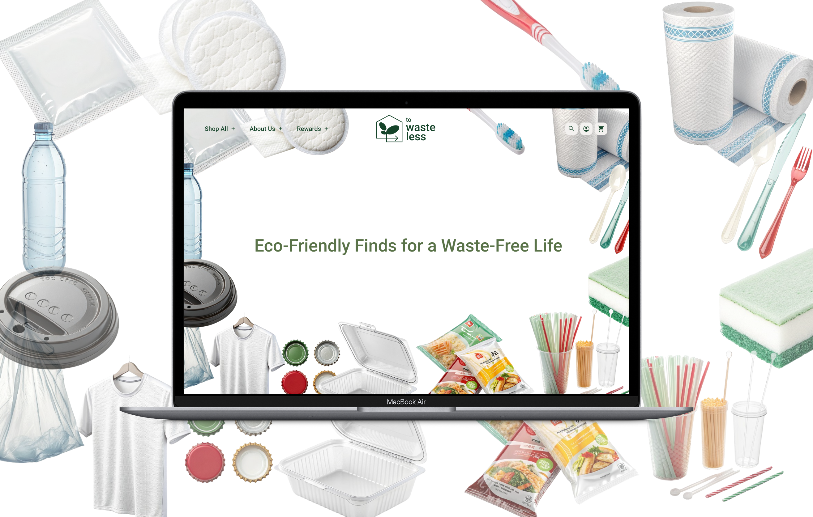
Transforming an online eco-shop into a lifestyle-driven brand for the eco-conscious community. Convenient product search and comparison by categories. Product photos and customer reviews are available. User account with purchase history, favorite items, and personalized discounts. Product payment and delivery options.
Users may distrust eco claims and struggle to verify genuine sustainability. Users may doubt the cleaning power of eco-friendly detergents. High prices can deter users from choosing sustainable options. Habit and brand loyalty keep users from switching to greener products.
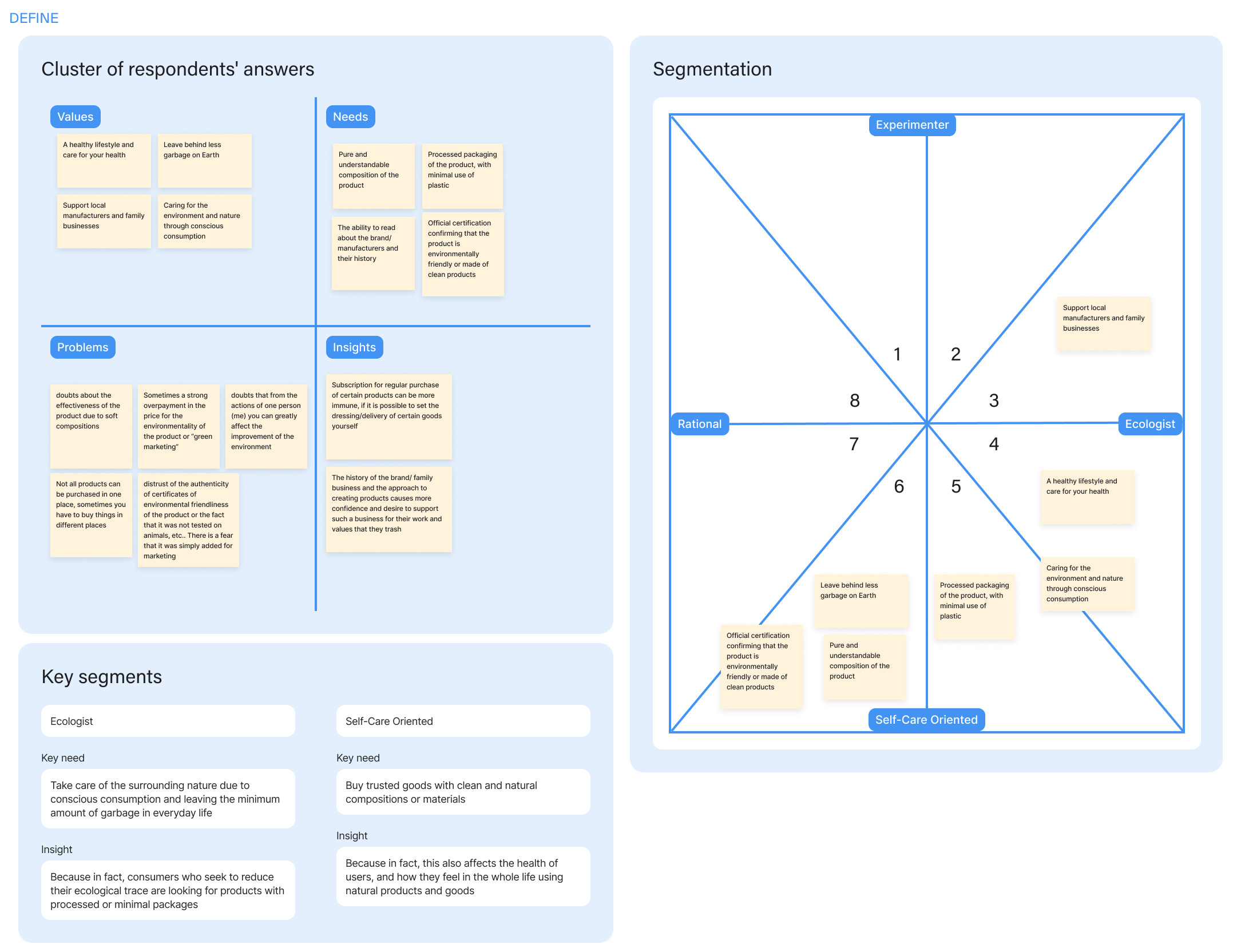
I researched environmentally conscious users to understand what drives their purchasing decisions, uncovering a strong preference for sustainable, non-toxic products driven by health concerns and lifestyle values. These insights informed design decisions that emphasized transparency, clarity, and product trust, aligning the shopping experience with users' wellness-focused and eco-friendly priorities.
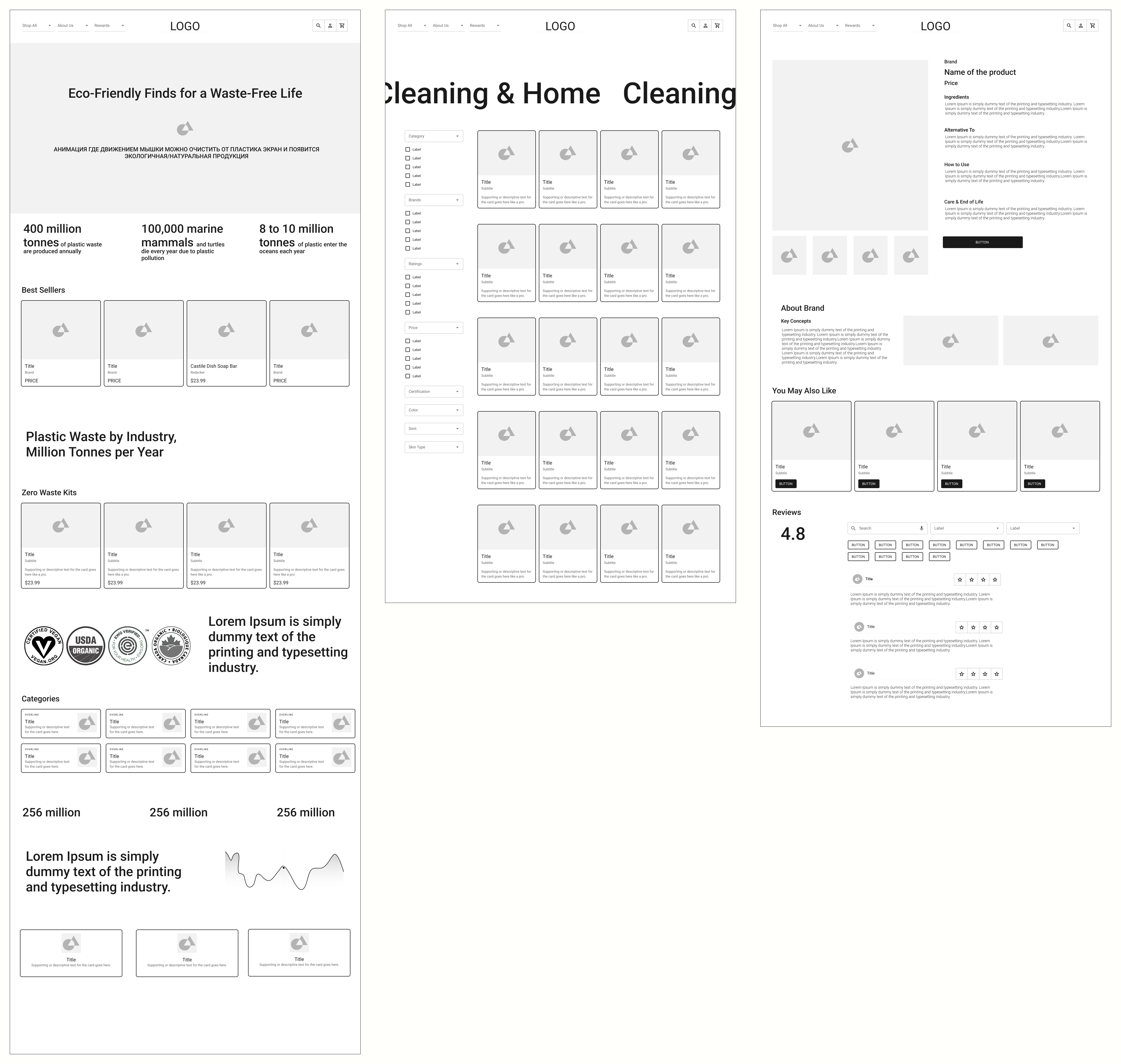
Building on insights from user research, I translated early ideas into low fidelity wireframes that defined the core shopping flow from product discovery and category browsing to product details and checkout. I then tested these low fidelity designs with users to validate the flow, identify usability issues early, and iterate on the structure before moving into high fidelity design.
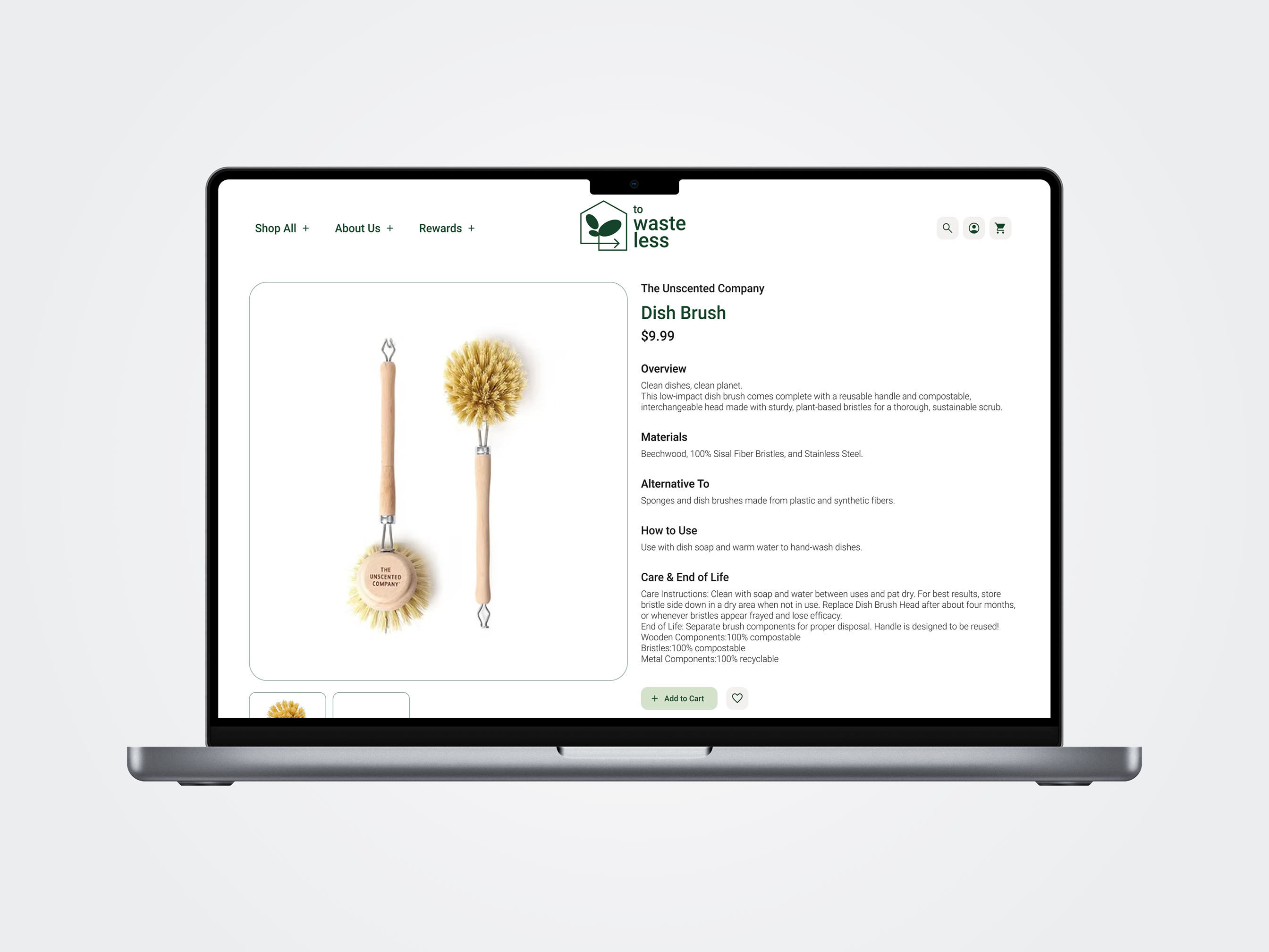
Building on wireframe testing and user feedback, I refined the To Waste Less platform in high fidelity, creating a minimal and interactive interface that helps users navigate the experience more intuitively. The final design improves product visibility, strengthens visual hierarchy, and clarifies product information, supporting confident decision-making throughout the shopping journey.
Building on wireframe testing and user feedback, I refined the To Waste Less product experience in high fidelity to support intuitive navigation and confident decision making.
Key Features: Clear product overview with transparent materials, usage, and sustainability details. Interactive product imagery to support exploration and comparison. Brand storytelling and related product suggestions to build trust and encourage discovery. Review summaries with filters and user images to validate quality through social proof.
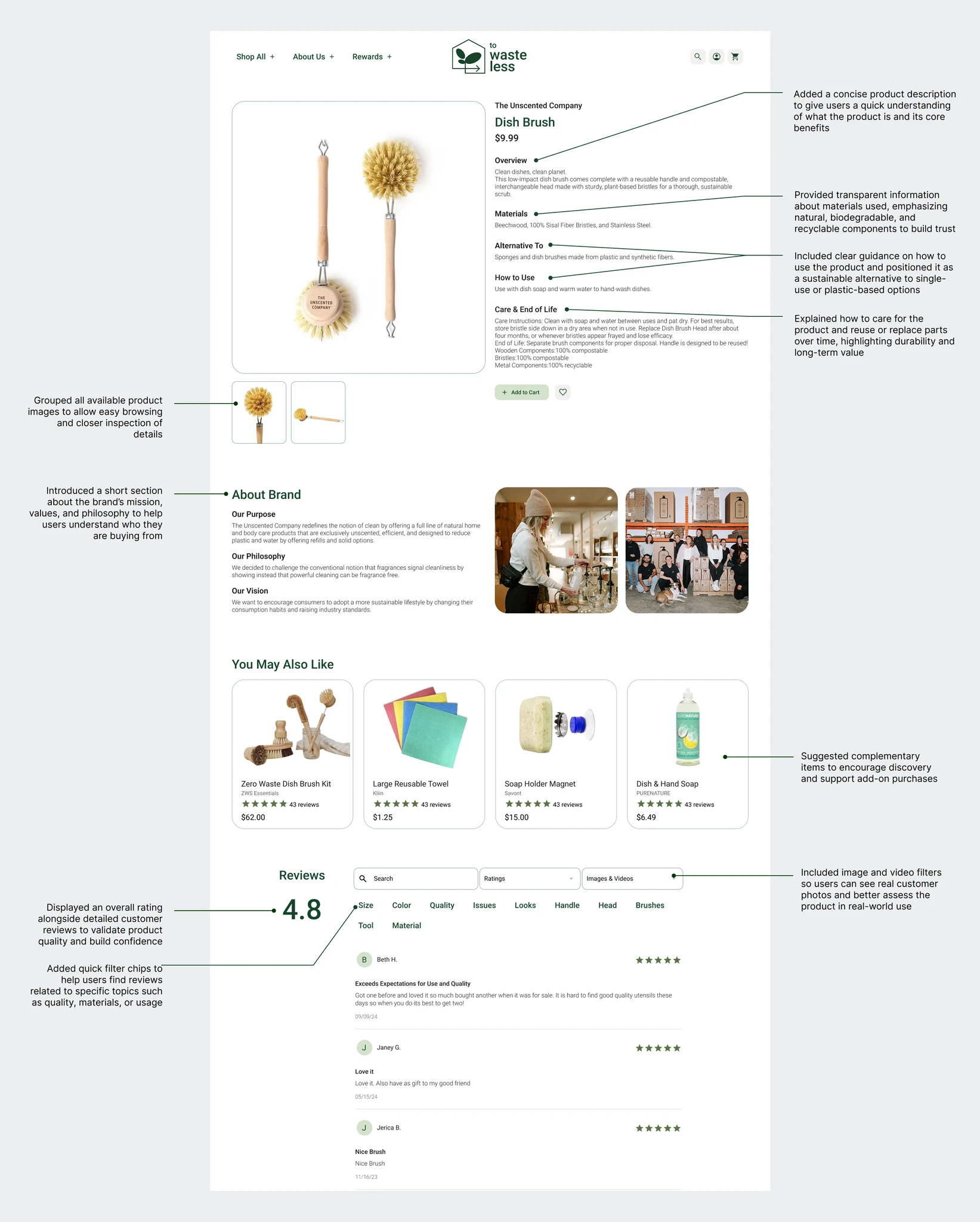
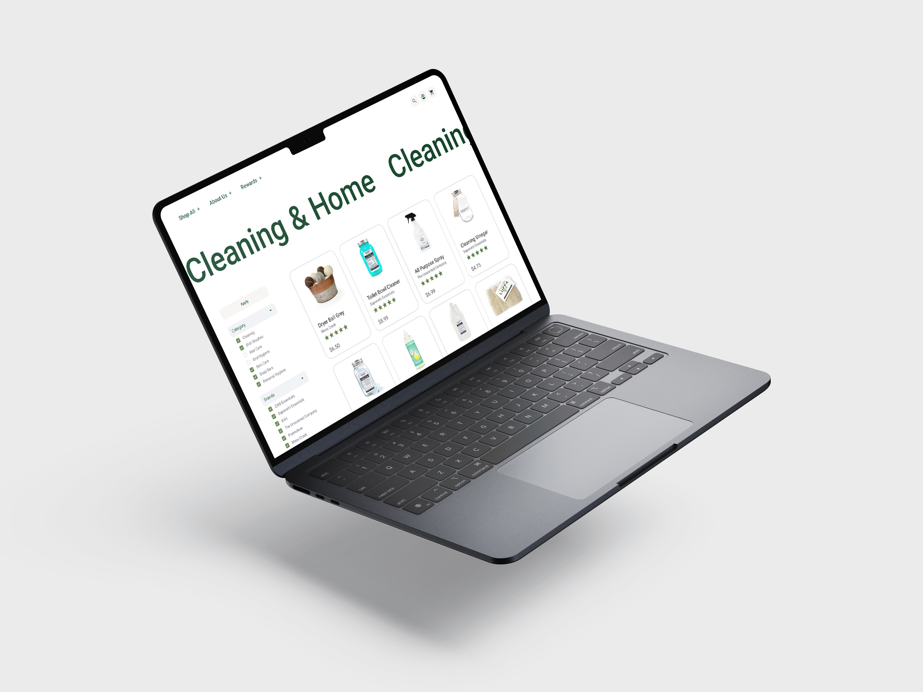
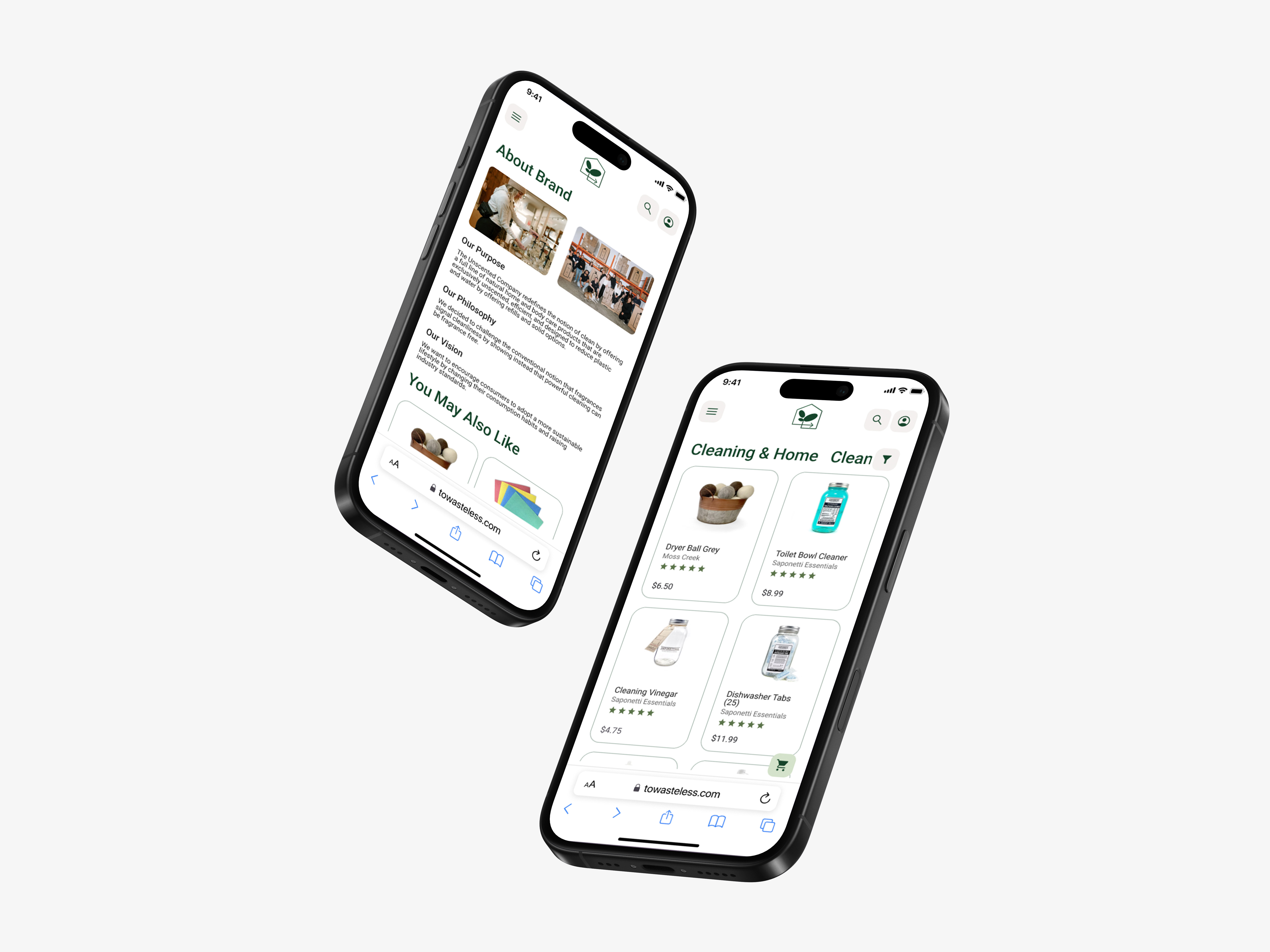
This project highlighted the importance of building trust in sustainable e-commerce experiences, where users often question product quality, materials, and eco claims. Through this work, I learned that redesigning the brand position was as important as improving usability. A minimal and clear UI became a key tool to support the idea of intentional shopping, encouraging users to focus on buying fewer but higher quality products that align with a healthy and sustainable lifestyle. The project also reinforced the value of testing early low fidelity concepts to validate navigation and content hierarchy before moving into high fidelity design.
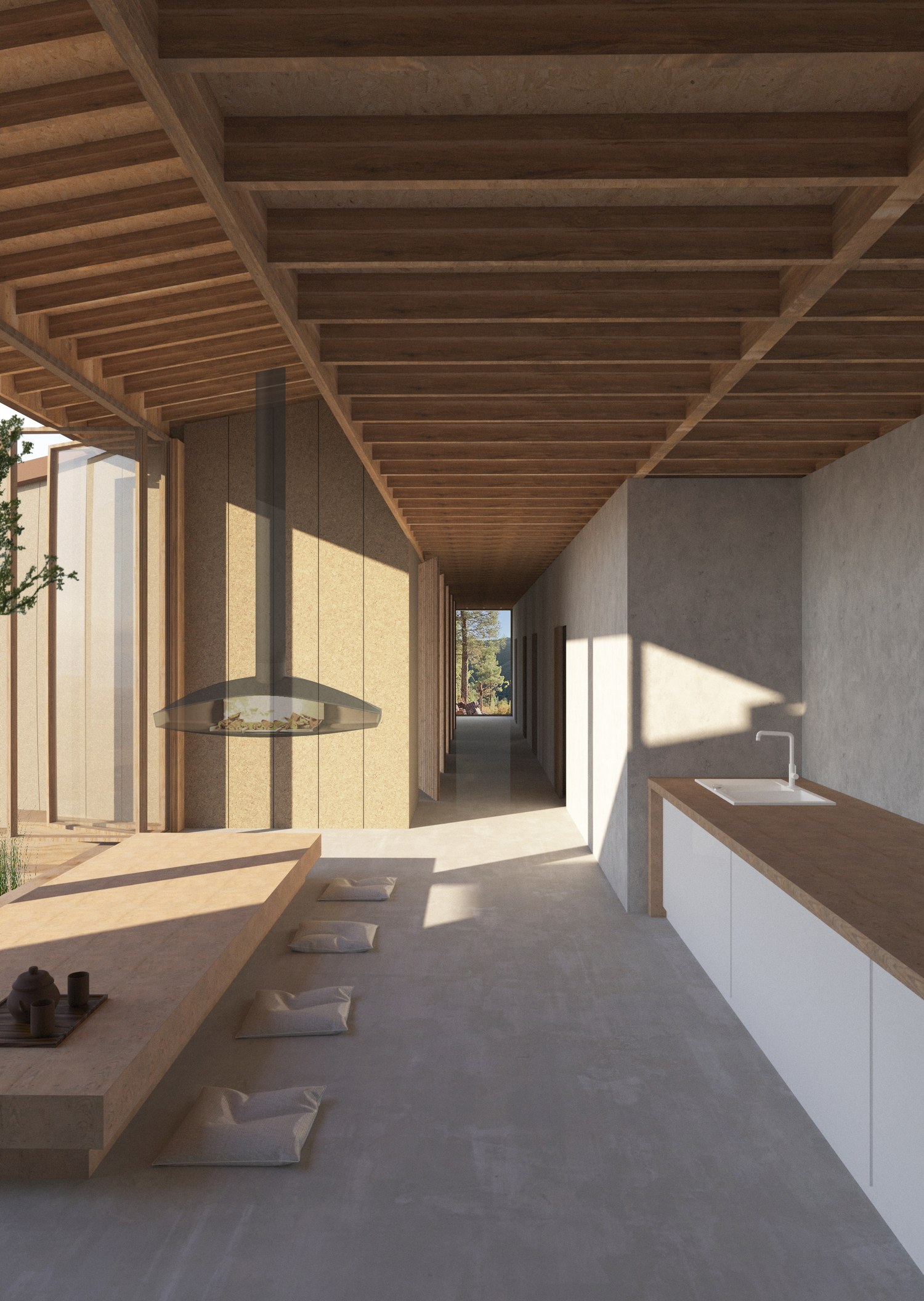
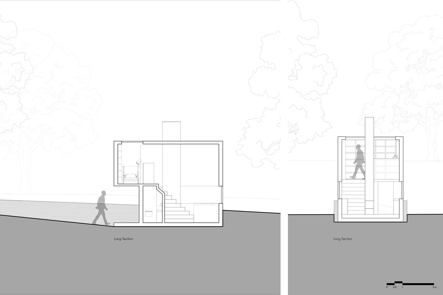
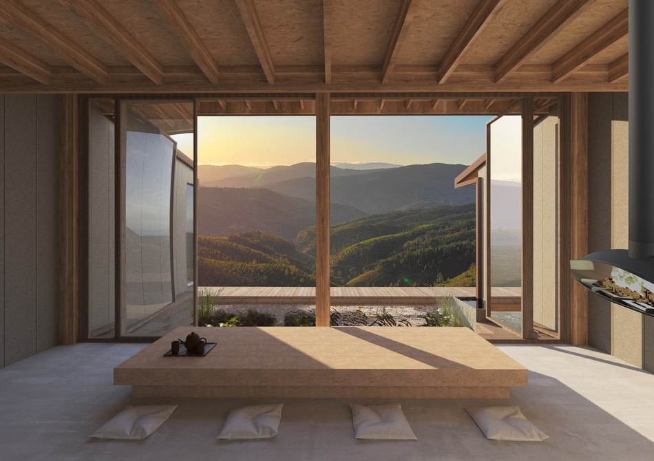
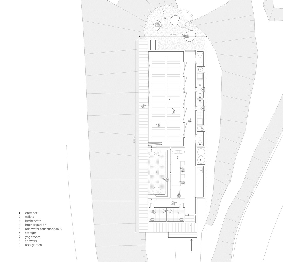
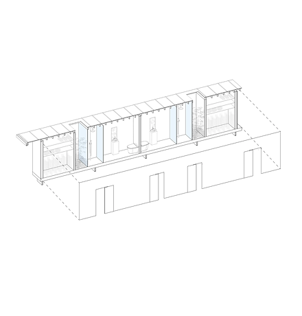
Set on the steep mountain slope, the yoga house project takes shape in representing the connection of seven chakras, the circular vortexes of energy that run along the length of the spine, from the pelvic floor to the crown of the head. Being a place for the practice of yoga and meditation, our primary strategy was to create a natural movement and intuitive way-finding inside the house, that will invite visitors to move through its parts as if they open their chakras during meditation practice. The House emphasizes the oblong shape of a given site and integrates interior spaces, landscape, and views. It consists of two main zones: a gathering space that merges into the interior garden and the heart of the house – a yoga room, articulated by a wide interior corridor and an outside deck. The kitchenette, showers, toilets, and storage rooms are organized along the corridor which creates a visual connection with a rock garden in the back. By opening the glass folding partitions in the yoga room, we propose a possibility to transform and enlarge the space during the warm days, maximize sunlight, and connect to nature. The scheme makes for an architecture that erases the boundary between interior and exterior, creates intermediate spaces, and allows to practice mindfulness and meditation in a harmony with nature.
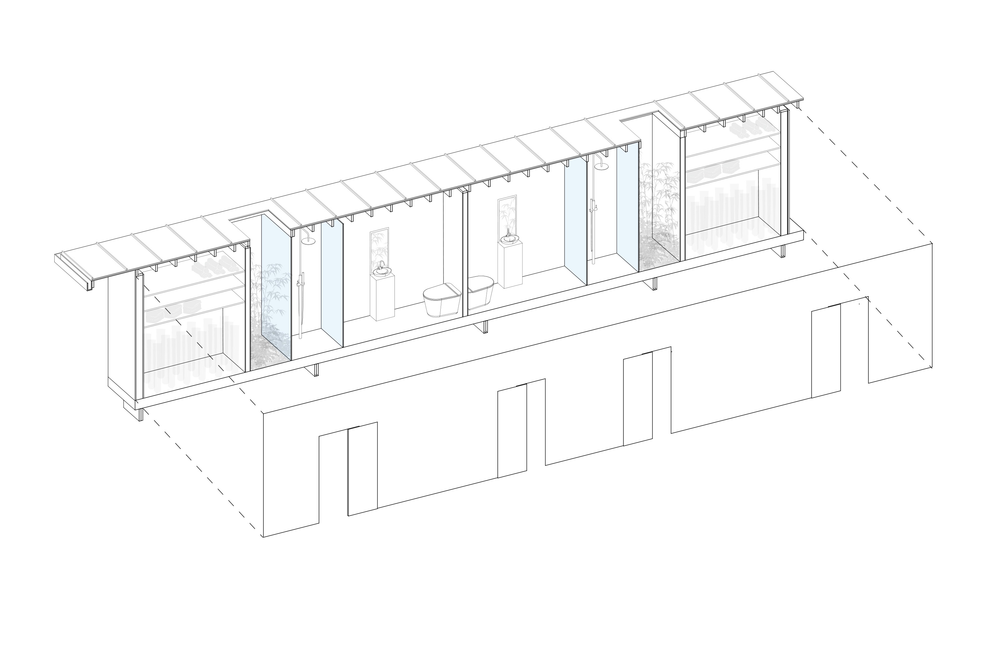
Exploded Axonometric View of Showers & Storage
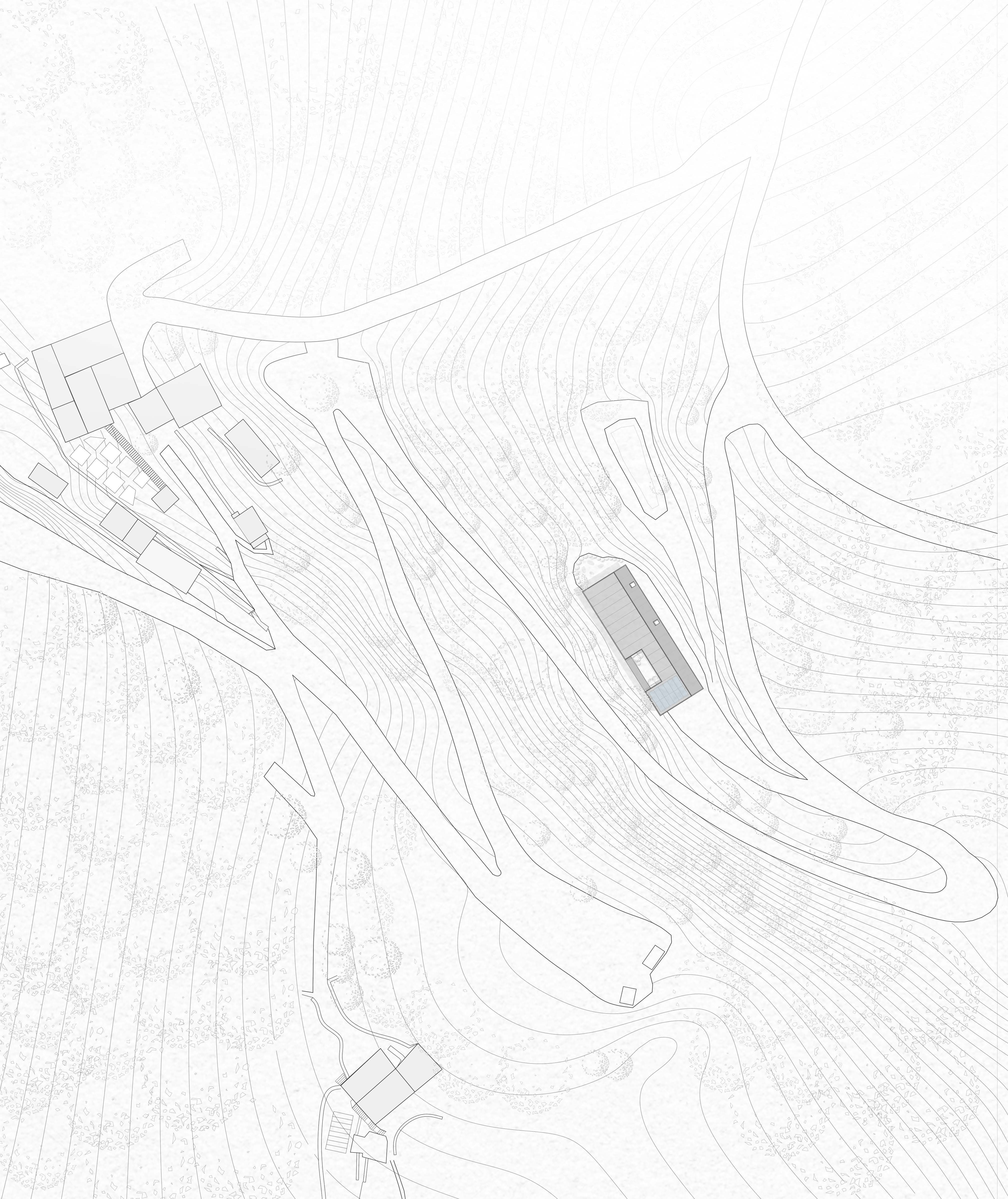
Site Plan
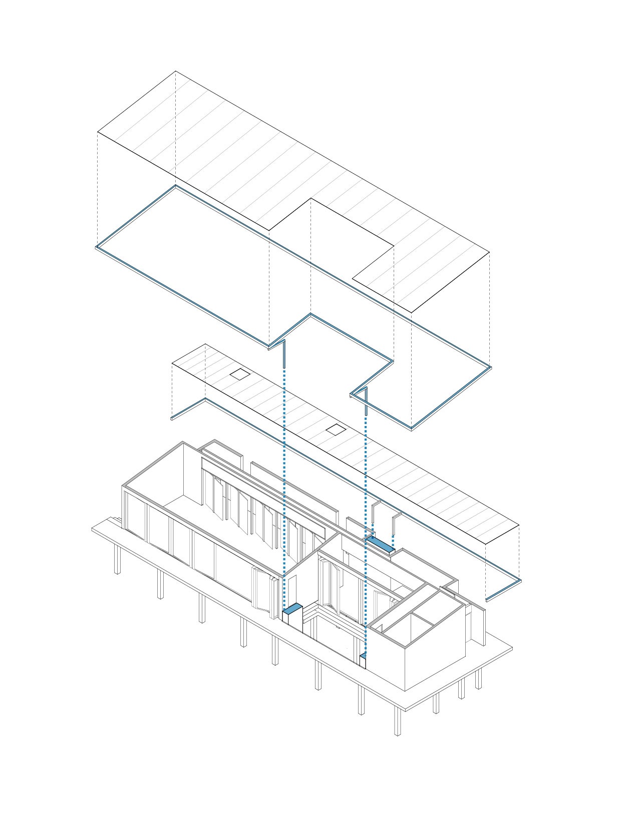
Rainwater Collection and Re-use
The sloped roof with gutters along the edges allows to collect rainwater and transfer it to the dedicated water tanks around the building. After collecting rainwater, it is filtered and stored in the tanks that can be used for utilitarian purposes of the building.
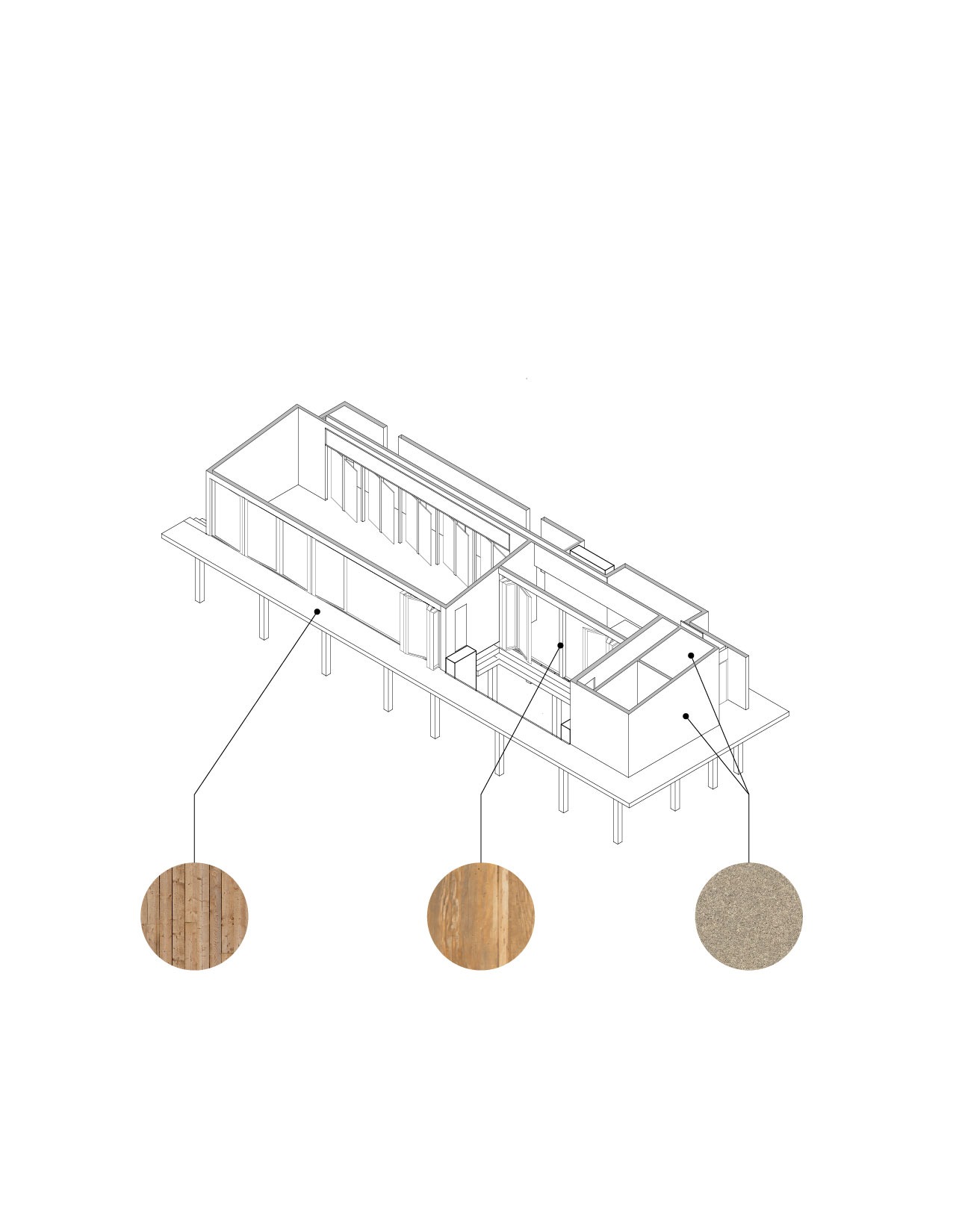
Sustainable and Locally Sourced Materials
3 main local materials are used in the project. The structure is made from pine timber as Portugal has the biggest number of pine trees in Europe. Exterior decking is assembled from pine slats as well. Thermacork panels act as both Interior and Exterior materials, by maintaining a good level of insulation and providing a warm and inviting look. Cork is an affordable, biodegradable, and available material to use in Portugal, as it is broadly exported throughout the world.
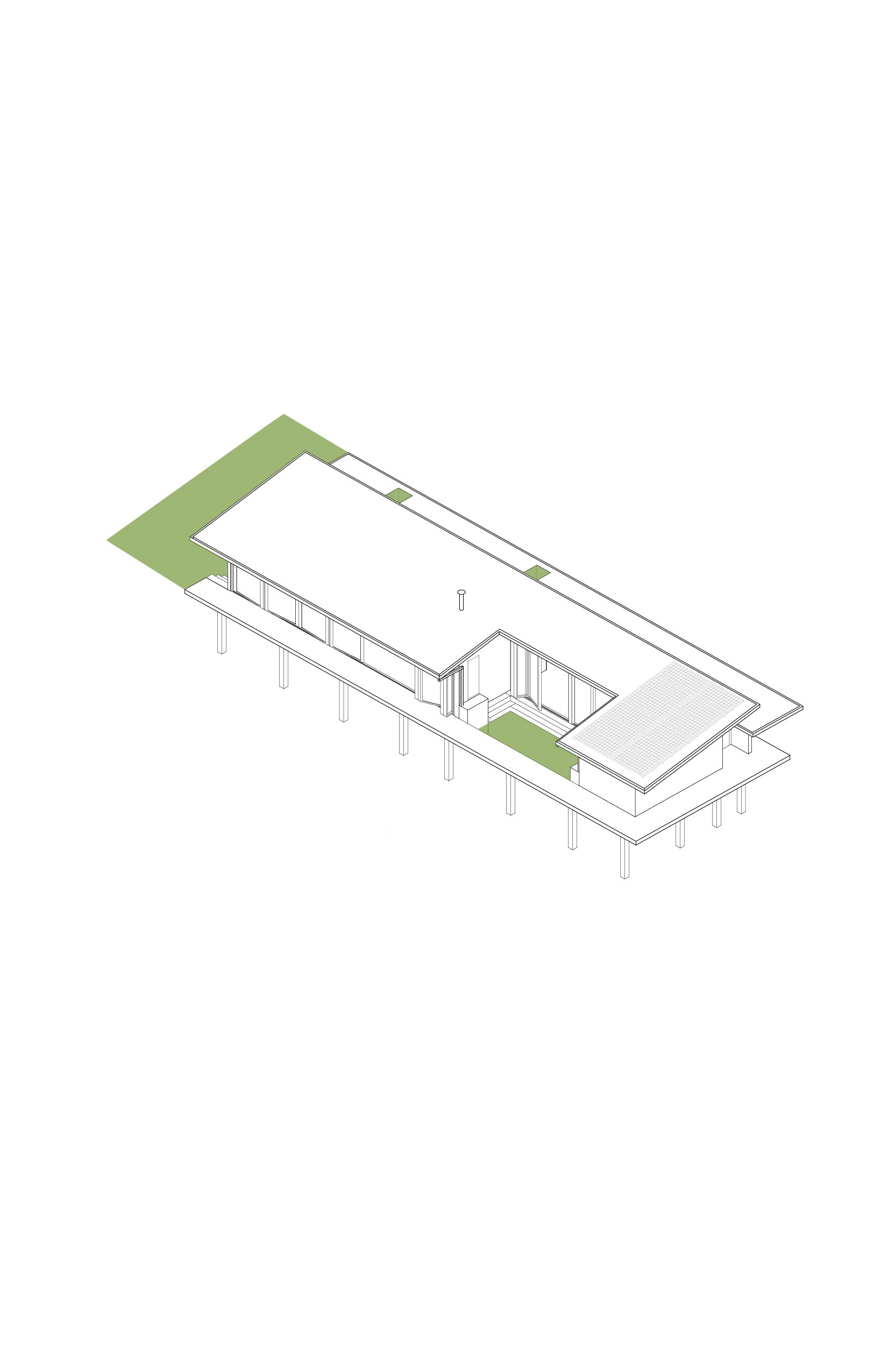
Mindful of Natural Surrounding
The green pocket spaces create a natural connection with an environment and landscape. The visual connection with nature from the inside inspires visitors to be aware of their surroundings and the present moment.
Natural Ventilation
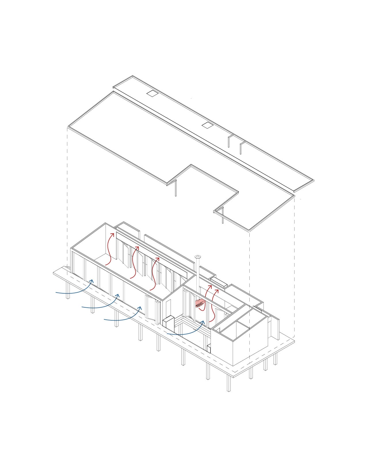
Extended roof overhangs provide shadows that prevent interior spaces from excessive sunlight and heat gain. Operable exterior glass partitions create an opportunity for natural cooling and air ventilation. A small chimney in the kitchenette area heats space during the rain and cold seasons of the year.
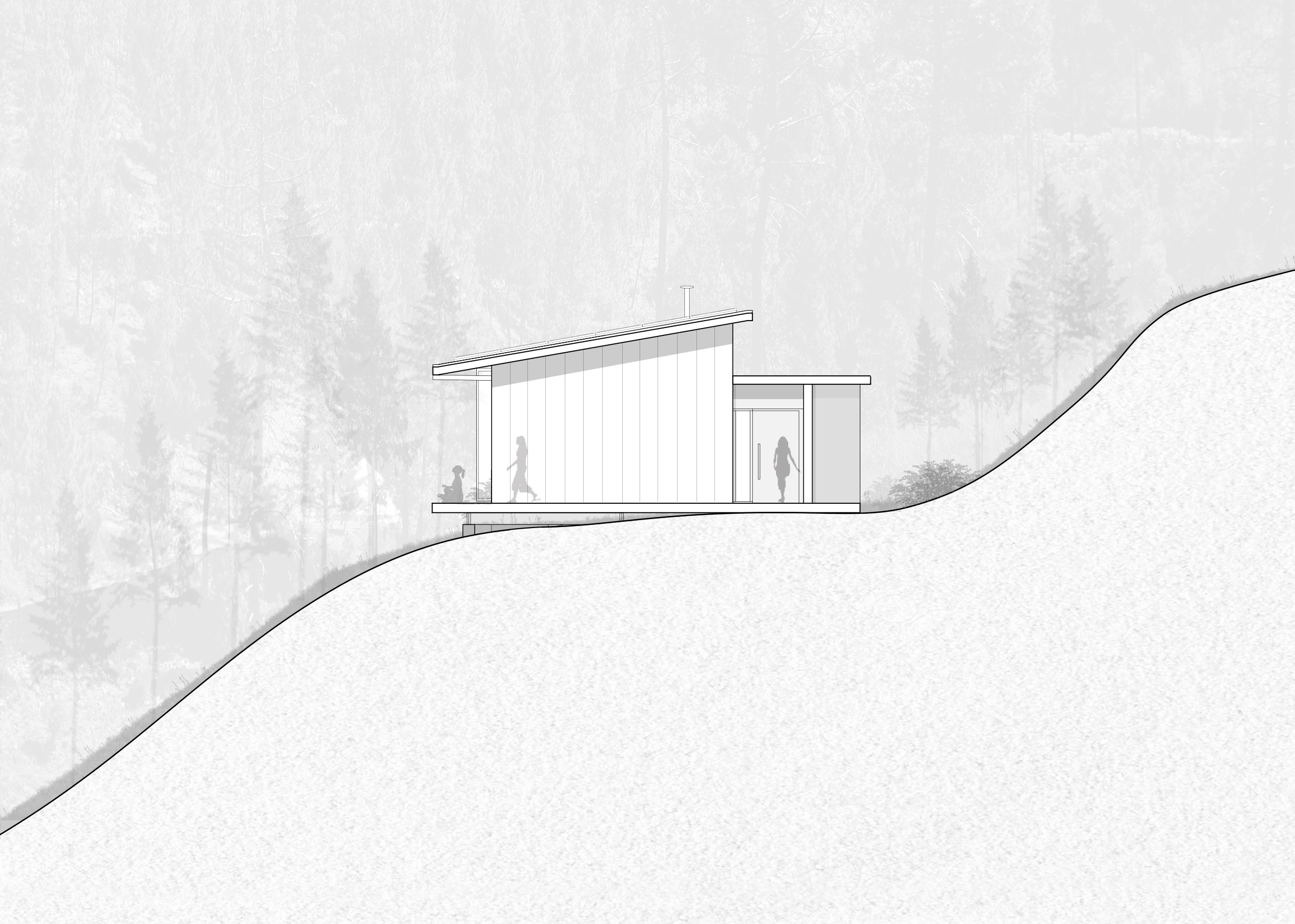
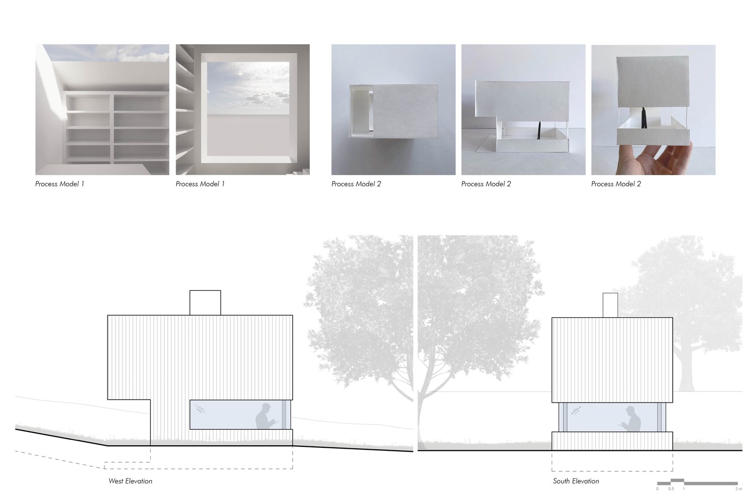
South Elevation
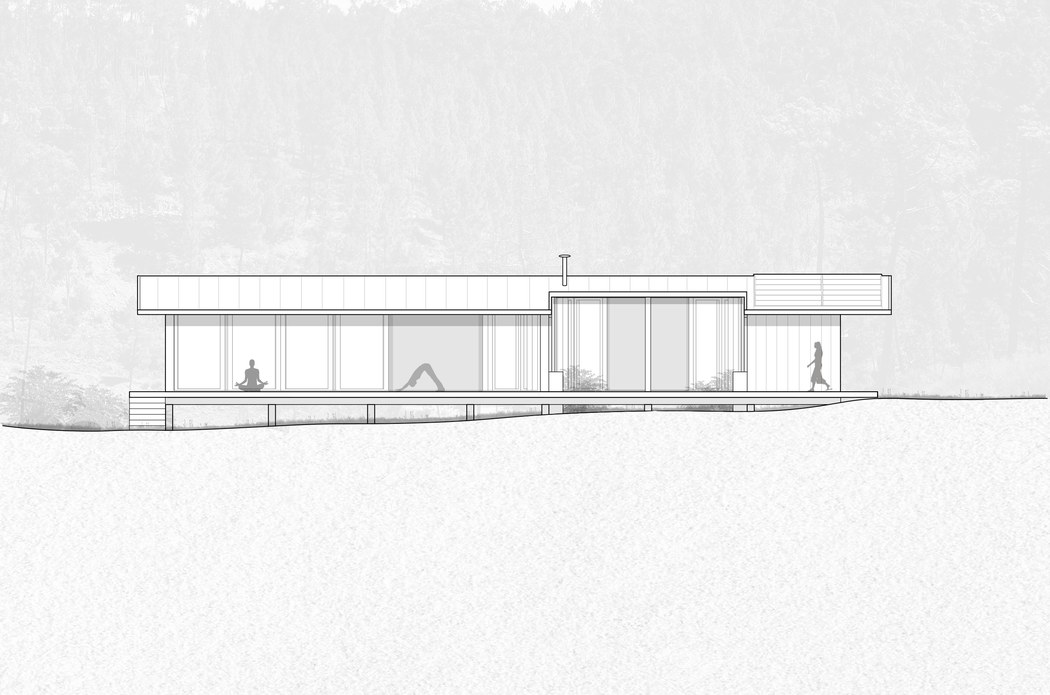
West Elevation
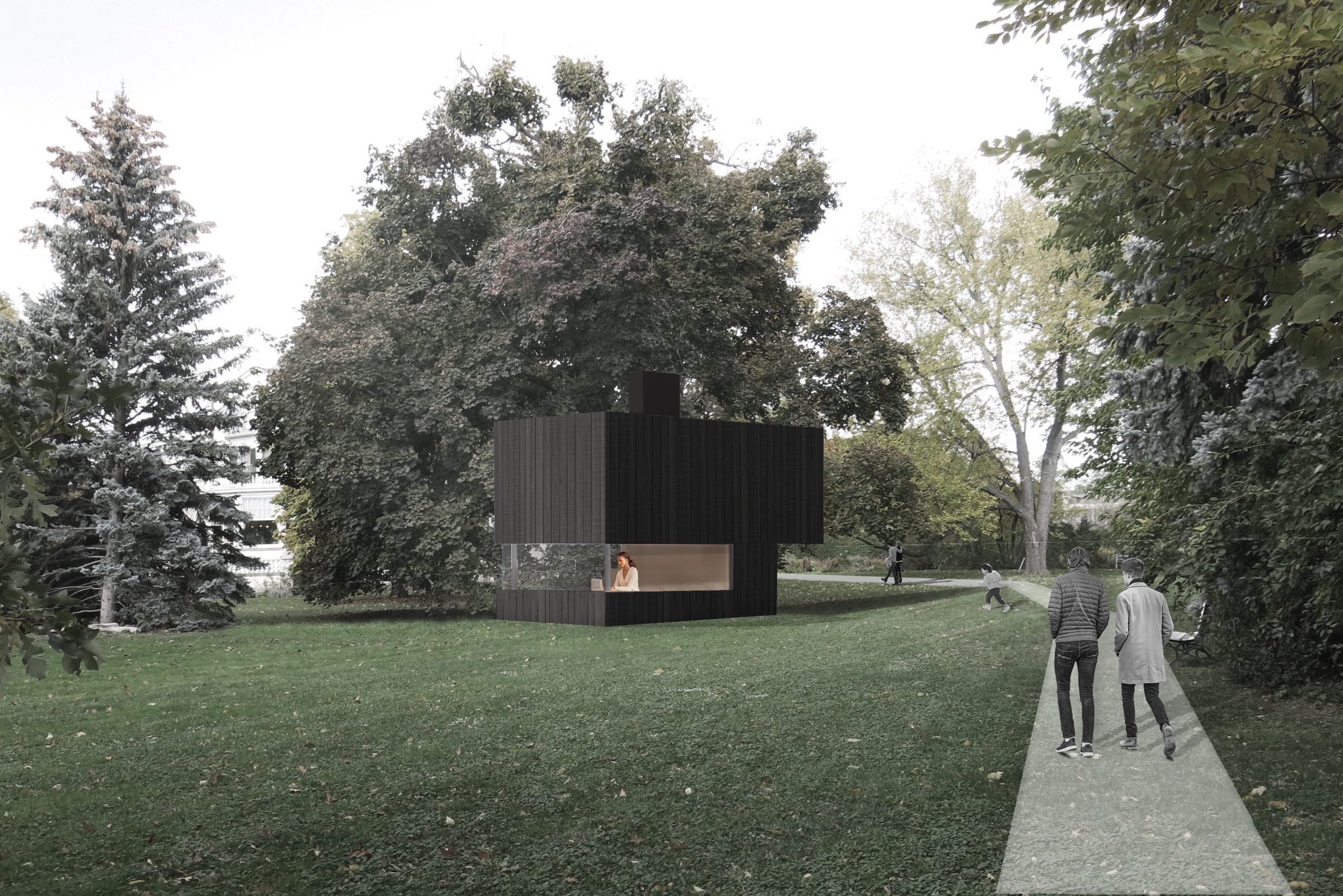
About
I began my career in architecture, designing physical spaces across civic, institutional, residential, and mixed-use projects. Over time, my interest expanded beyond the built environment into the ways people navigate digital products, visual systems, and interactive experiences. This shift led me toward product design, where I combine spatial thinking, visual communication, and a user-centered approach to create digital experiences that are clear, thoughtful, and intuitive
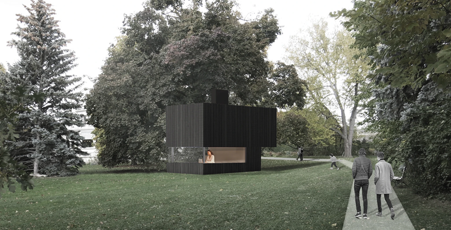
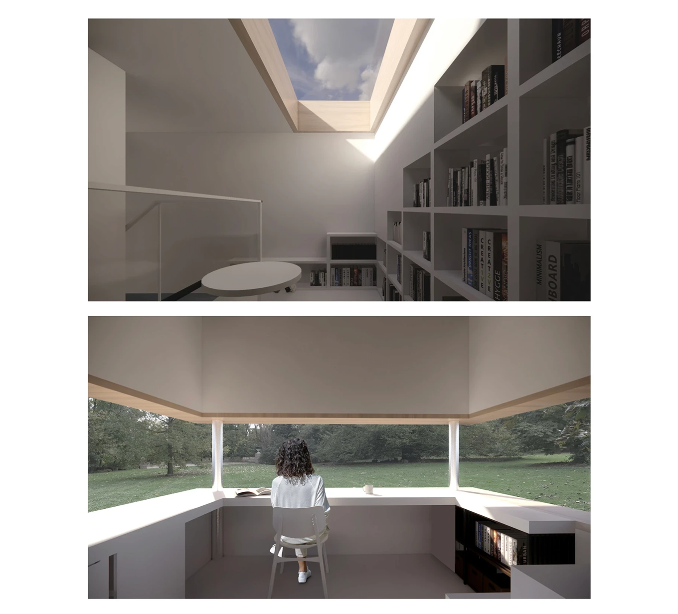
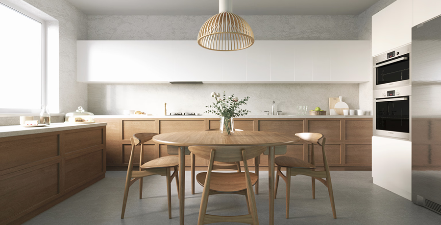
Architectural Design Projects
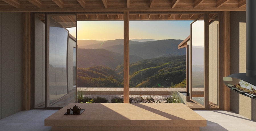
Photography